

Question: please show the work on excel Make graphs for each frequency distribution using Excel graphs. Specifically a.) Make a pie chart on the categorical data
please show the work on excel
Make graphs for each frequency distribution using Excel graphs. Specifically
a.) Make a pie chart on the categorical data set
b.) Make pareto chart for the categorical data set.
c.) Make a frequency histogram for the continuous frequency distribution
d.) Make a relative frequency polygon for the continuous frequency distribution.
e.) Make only a frequency histogram for the discrete frequency distribution.
NOTE: There is no graph for the contingency table.
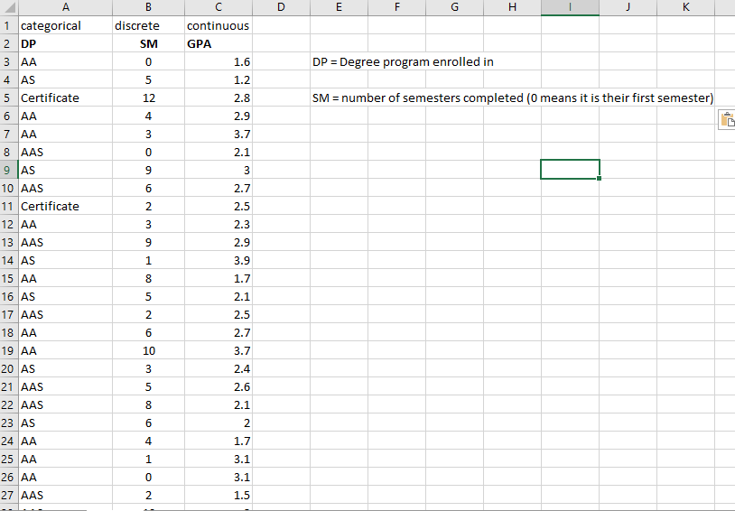
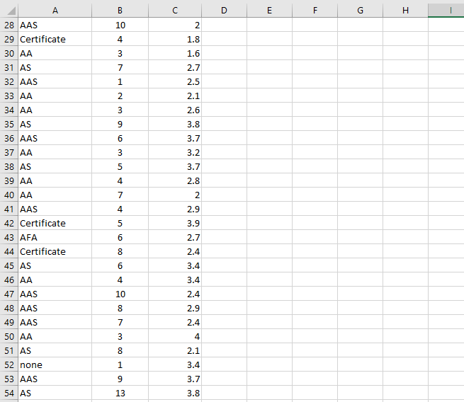
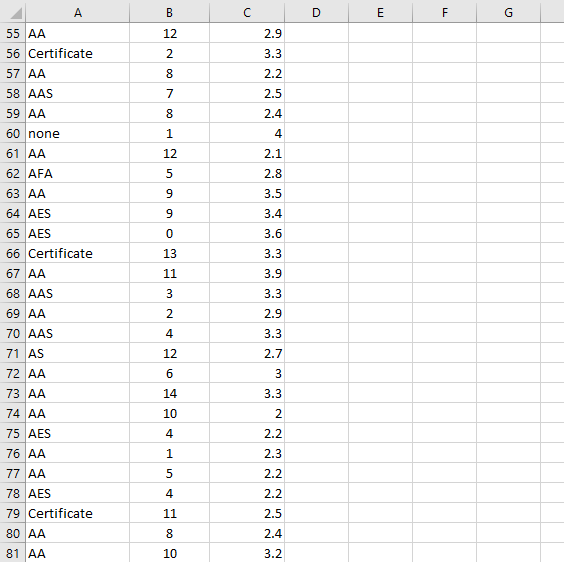
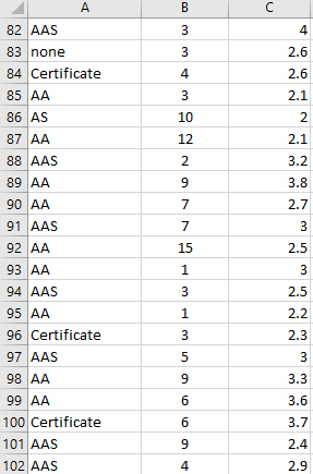
this is the data as link and screenshot
https://drive.google.com/file/d/1kvHL52vIXKwGPn5GxAWwh4-ecgzLIL0y/view?usp=sharing
\f\f\f\f
Step by Step Solution
There are 3 Steps involved in it
1 Expert Approved Answer
Step: 1 Unlock

Question Has Been Solved by an Expert!
Get step-by-step solutions from verified subject matter experts
Step: 2 Unlock
Step: 3 Unlock