

Question: Please show your work on spss (formulas) explain or show as many details as possible, and answer the questions below. Assume we are conducting a
Please show your work on spss (formulas) explain or show as many details as possible, and answer the questions below.
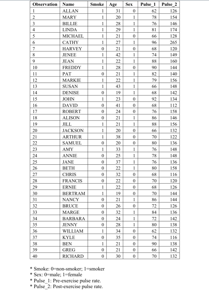
Assume we are conducting a study on how men and women's bodies react differently to exercise routines in the data provided at the end of this assignment (p. 3). For our study, we have gathered information on 40 subjects. Our variables include the subjects' sex, age, whether they smoke, and their pre and post exercise pulse rates. Use the SPSS dataset provided and conduct the following analysis. Paste your SPSS outputs into this document for each question. 1. Box and Whiskers Plot A pre-workout pulse rate (Pulse 1) is something that should be normally distributed if we have done a good job of randomly selecting our participants. In order to check if our data is normally distributed and contains any extreme values (outliers), create box and whisker plots for both the male (coded as 0) and female (coded as 1) pre-exercise pulse rates. There are several ways to create a box and whisker plot in SPSS, but the easiest is 1. 2. Click "Graphs" >"Legacy Dialogs" > "Box Plot." You will see two choices for how to display your plot, choose "Simple" and in the area that says "Data in Chart Are" choose "Summaries for Groups of Cases." Then click "Define." Here you will define the variables for your plot. For "Variable," choose the pre-exercise pulse For "Category Axis," choose sex. For "Label Cases By," choose name. This allows us to identify specific cases in the plot. Then click "OK." 3. 4. a) b) c) d) What is the median pulse rate for men? What is it for women? Approximately, what is the lowest pulse rate for men? For women? One of our groups has outliers. Which has outliers? SPSS identifies which observations are the outliers. They are identified in the box and whiskers plot. Which observations are the outliers? 2. Bar Charts Create a bar chart to display the average post-exercise pulse rates (Pulse 2) for smokers (coded as 1) vs. non-smokers (coded 0). To do this 1. 2. Click "Graphs" > "Legacy Dialogs" >"Bar." Choose "Simple" and in the area that says "Data in Chart Are" choose "Summaries for Groups of Cases." When defining the variables for your chart, under "Bar Represent" choose "other statistic." (This will default to presenting means for your variable.) For "Variable," choose post-exercise pulse. For "Category Axis," choose smoke 3. 4. a) What level of measurement is our smoking variable? b) Who (on average) has the highest post-exercise pulse rate? Assume we are conducting a study on how men and women's bodies react differently to exercise routines in the data provided at the end of this assignment (p. 3). For our study, we have gathered information on 40 subjects. Our variables include the subjects' sex, age, whether they smoke, and their pre and post exercise pulse rates. Use the SPSS dataset provided and conduct the following analysis. Paste your SPSS outputs into this document for each question. 1. Box and Whiskers Plot A pre-workout pulse rate (Pulse 1) is something that should be normally distributed if we have done a good job of randomly selecting our participants. In order to check if our data is normally distributed and contains any extreme values (outliers), create box and whisker plots for both the male (coded as 0) and female (coded as 1) pre-exercise pulse rates. There are several ways to create a box and whisker plot in SPSS, but the easiest is 1. 2. Click "Graphs" >"Legacy Dialogs" > "Box Plot." You will see two choices for how to display your plot, choose "Simple" and in the area that says "Data in Chart Are" choose "Summaries for Groups of Cases." Then click "Define." Here you will define the variables for your plot. For "Variable," choose the pre-exercise pulse For "Category Axis," choose sex. For "Label Cases By," choose name. This allows us to identify specific cases in the plot. Then click "OK." 3. 4. a) b) c) d) What is the median pulse rate for men? What is it for women? Approximately, what is the lowest pulse rate for men? For women? One of our groups has outliers. Which has outliers? SPSS identifies which observations are the outliers. They are identified in the box and whiskers plot. Which observations are the outliers? 2. Bar Charts Create a bar chart to display the average post-exercise pulse rates (Pulse 2) for smokers (coded as 1) vs. non-smokers (coded 0). To do this 1. 2. Click "Graphs" > "Legacy Dialogs" >"Bar." Choose "Simple" and in the area that says "Data in Chart Are" choose "Summaries for Groups of Cases." When defining the variables for your chart, under "Bar Represent" choose "other statistic." (This will default to presenting means for your variable.) For "Variable," choose post-exercise pulse. For "Category Axis," choose smoke 3. 4. a) What level of measurement is our smoking variable? b) Who (on average) has the highest post-exercise pulse rate
Step by Step Solution
There are 3 Steps involved in it

Get step-by-step solutions from verified subject matter experts