

Question: Plot a histogram and pie chart. Ensure they are well labeled Where do the values tend to cluster for your data (if anywhere)? Why would
- Plot a histogram and pie chart. Ensure they are well labeled
- Where do the values tend to cluster for your data (if anywhere)? Why would data be focused there?
- Are there any trends or patterns? For instance, is your data uniform, bell-shaped, bathtub-shaped, etc.? Is the frequency increasing/decreasing as you progress through the intervals or is it more evenly distributed? Why would your data have these trends or patterns?
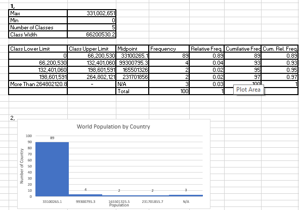
1. Max 331,002,651 Min 0 Number of Classes 5 Class Width 56200530.2 Class Lower Limit Class Upper Limit Midpoint Frequency Relative Freq. Cumilative Free Cum. Rel. Freq 56,200,530 33100265.1 89 0.89 39 0.89 56,200,530 132.401,060 99300795.3 0.04 93 0.93 132.401,060 198,601,591 165501326 0.02 0.85 198,601,591 264.802.121 231701856 0.02 0.97 More Than 264802120.8 NIA 0.03 100 Total 100 Plot Area 2. World Population by Country 100 89 Number of Country 68586939 2 2 3 33 100265.1 99300795.3 165501325.5 C'S58TOCTEZ Population
Step by Step Solution
There are 3 Steps involved in it
1 Expert Approved Answer
Step: 1 Unlock

Question Has Been Solved by an Expert!
Get step-by-step solutions from verified subject matter experts
Step: 2 Unlock
Step: 3 Unlock