

Question: Problem 3 - Plots (Plese using Python and careful follow the instruction below:) If you are not following the rubrics, you will NOT receive a
Problem 3 - Plots (Plese using Python and careful follow the instruction below:)
If you are not following the rubrics, you will NOT receive a thumb up !!!!!!!!!!!!!!!!
The instruction for this question might be a bit long, but I think you can solve it around 20 minutes!
Here is the Set-up for this question:
You can just easily copy paste all the setup codes and add new code in it :)

Here is the instruction of the question:
 Thank you :-)
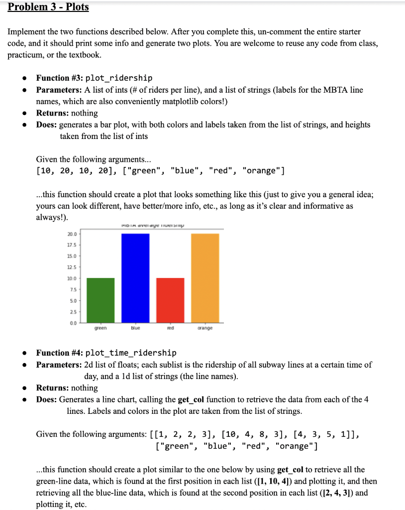
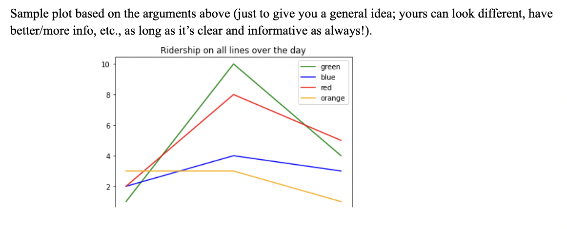
Implement the two functions described below. After you complete this, un-comment the entire starter code, and it should print some info and generate two plots. You are welcome to reuse any code from class, practicum, or the textbook. - Function \#3: plot_ridership - Parameters: A list of ints (\# of riders per line), and a list of strings (labels for the MBTA line names, which are also conveniently matplotlib colors!) - Returns: nothing - Does: generates a bar plot, with both colors and labels taken from the list of strings, and heights taken from the list of ints Given the following arguments... [10,20,10,20],["green","blue","red","orange"] ...this function should create a plot that looks something like this (just to give you a general idea; yours can look different, have better/more info, etc., as long as it's clear and informative as always!). - Function \#4: plot_time_ridership - Parameters: 2d list of floats; each sublist is the ridership of all subway lines at a certain time of day, and a 1d list of strings (the line names). - Returns: nothing - Does: Generates a line chart, calling the get_col function to retrieve the data from each of the 4 lines. Labels and colors in the plot are taken from the list of strings. Given the following arguments: [[1,2,2,3],[10,4,8,3],[4,3,5,1]], ["green", "blue", "red", "orange"] ...this function should create a plot similar to the one below by using get_col to retrieve all the green-line data, which is found at the first position in each list ([1,10,4]) and plotting it, and then retrieving all the blue-line data, which is found at the second position in each list ([2,4,3]) and plotting it, etc. Sample plot based on the arguments above (just to give you a general idea; yours can look different, have better/more info, etc., as long as it's clear and informative as always!)
Step by Step Solution
There are 3 Steps involved in it

Get step-by-step solutions from verified subject matter experts