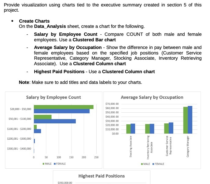
Question: Provide visualization using charts tied to the executive summary created in section 5 of this project. Create Charts On the Data_Analysis sheet, create a chart

Provide visualization using charts tied to the
Provide visualization using charts tied to the executive summary created in section 5 of this project. Create Charts On the Data_Analysis sheet, create a chart for the following. Salary by Employee Count - Compare COUNT of both male and female employees. Use a Clustered Bar chart Average Salary by Occupation - Show the difference in pay between male and female employees based on the specified job positions (Customer Service Representative, Category Manager, Stocking Associate, Inventory Retrieving Associate). Use a Clustered Column chart Highest Paid Positions - Use a Clustered Column chart Note: Make sure to add titles and data labels to your charts. Salary by Employee Count Average Salary by Occupation $70,000.00 $20,000 - $50,000 $60,000.00 $50,000.0D 540,000.00 $50,001 - $100,000 $30,000.00 $20,000.00 $100,001 - $200,000 $10,000.00 50.00 $200,001 - $300,000 Representative Customer Service Category Manager Stocking Associate Inventory Retrieving Associate $300,001 - 5400,000 50 100 150 200 250 MALE FEMALE MALE . FEMALE Highest Paid Positions 5350 000.00

Step by Step Solution

There are 3 Steps involved in it

1 Expert Approved Answer
Step: 1 Unlock blur-text-image
Question Has Been Solved by an Expert!

Get step-by-step solutions from verified subject matter experts

Step: 2 Unlock
Step: 3 Unlock

Students Have Also Explored These Related General Management Questions!