

Question: Python CSE 231 Lab #15 Bar Graph We provide a comma-separated-value file, STC_2014_STC005.csv, of tax data from the US Census Bureau: http://www.census.gov/govs/statetax/ We are interested
Python CSE 231 Lab #15
Bar Graph
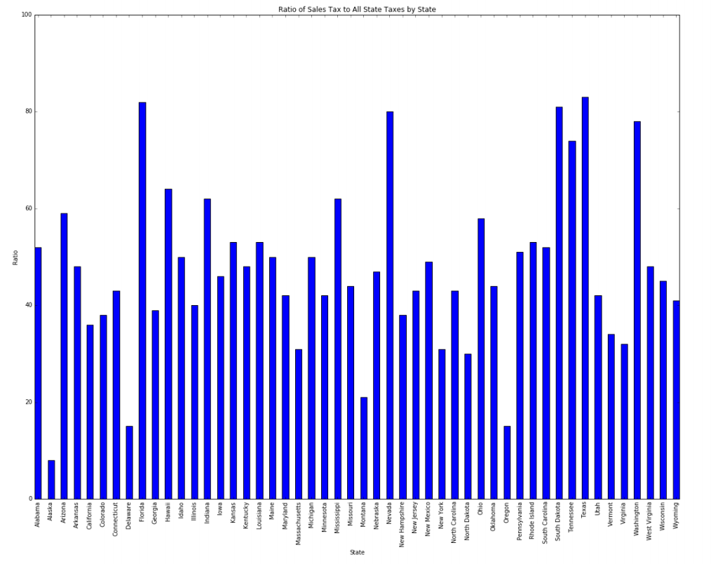
We provide a comma-separated-value file, STC_2014_STC005.csv, of tax data from the US Census Bureau: http://www.census.gov/govs/statetax/ We are interested in three columns: state name (at index 2), Total Taxes (at index 3), and Sales and Gross Receipts Taxes (at index 5). There are some header lines to ignore, but the data columns are clean (no missing or weird characters). For each state (i.e. each row) calculate the percent of Total Taxes that are Sales and Gross Receipts Taxes, i.e. values at index 5 over values at index 3. Note that the states are already in alphabetical order (hint: that should guide your choice of data structure). Write a program that reads that csv file and plots these values as a bar graph with states on the x-axis and percent on the y-axis. Your task is to make a bar graph that looks like this:
To guide you through creating the bar graph we have provided a file bar_demo.py . The demo illustrates how to make a simple bar graph. Run it. There are a number of commented out lines that you will find helpful to make a bar graph look like the one above. Experiment with those lines with the bar_demo.py program and then use what you learn to create the plot above.
bar_demo.py
# Simple bar graph import pylab values = [20, 80, 50, 75] indices = [i for i in range(len(values))] # figsize adjusts the entire figure dimensions -- place before other pylab instructions #pylab.figure(figsize=(10,5)) pylab.title("Simple Bar Graph Demo") pylab.xlabel('X-axis label') pylab.ylabel('Y-axis label') # 1. These next two lines put labels on the x axis, one at each of the indices names = ['fred','ming','rose','rich'] pylab.xticks(indices,names,rotation=90) # 2. What does ylim do? pylab.ylim([0,100]) # simple plot #pylab.bar(indices,values) # 3. more complex plot especially when combined with xticks line above mybarwidth = 0.8 # default is 0.8; you might want it smaller pylab.bar(indices,values,mybarwidth,align='center') Alabama Alaska Arizona Arkansas California Colorado Connecticut Delaware Florida Georgia Idaho Illinois indiana Iowa Kansa Kentucky Louisiana Maine Maryland Massachusetts Michigan Minnesota ssissippi Missouri Montana Nebraska Nevada New Hampshire New Jersey New Mexico New York North Carolina North Dakota Ohio Oklahoma Pennsylva Rhode Island South Carolina South Dakota Tennessee Texas Utah Vermont Virginia Washington West Virginia Wisconsin Wyoming Ratio
Step by Step Solution
There are 3 Steps involved in it

Get step-by-step solutions from verified subject matter experts