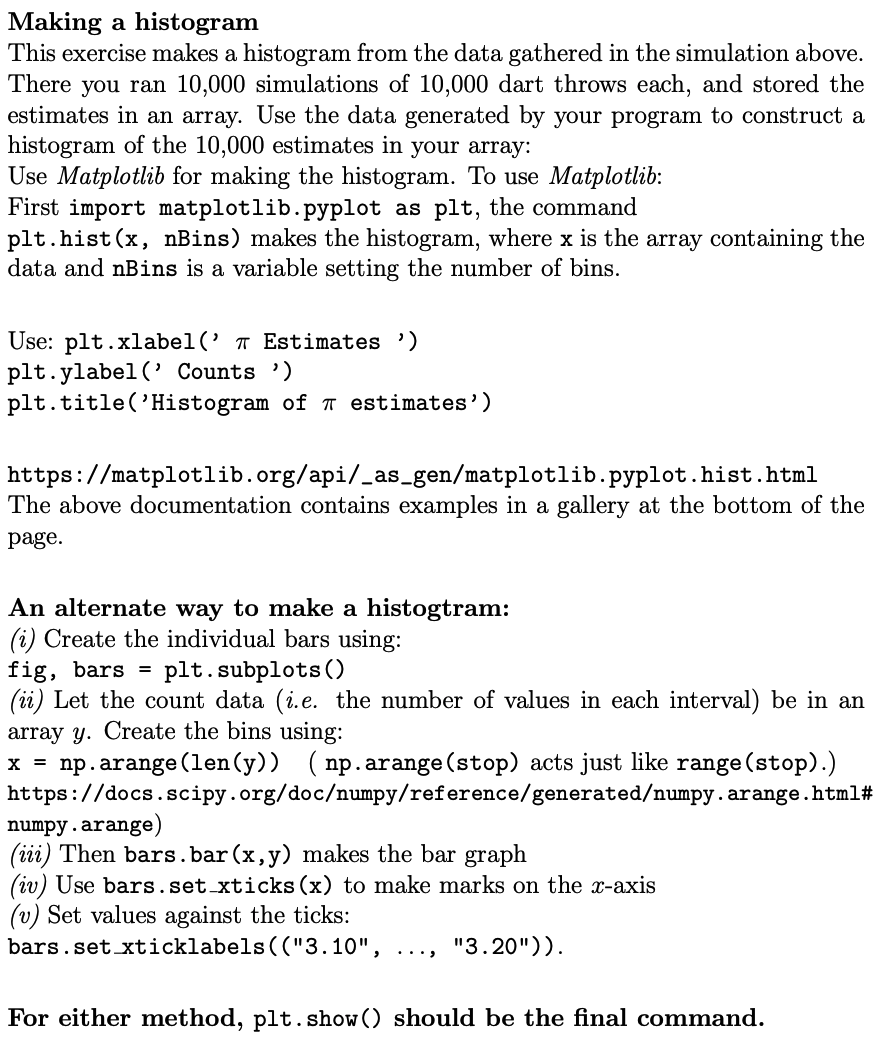
Question: python Making a histogram This exercise makes a histogram from the data gathered in the simulation above. There you ran 10,000 simulations of 10,000 dart
 python
Making a histogram This exercise makes a histogram from the data gathered in the simulation above. There you ran 10,000 simulations of 10,000 dart throws each, and stored the estimates in an array. Use the data generated by your program to construct a histogram of the 10,000 estimates in your array: Use Matplotlib for making the histogram. To use Matplotlib: First import matplotlib.pyplot as plt, the command plt.hist(x, nBins) makes the histogram, where x is the array containing the data and nBins is a variable setting the number of bins. Use: plt.xlabel(' a Estimates ) plt.ylabel('Counts ") plt.title('Histogram of a estimates') https://matplotlib.org/api/_as_gen/matplotlib.pyplot.hist.html The above documentation contains examples in a gallery at the bottom of the page. An alternate way to make a histogtram: (i) Create the individual bars using: fig, bars = plt. subplots() (ii) Let the count data (i.e. the number of values in each interval) be in an array y. Create the bins using: x = np.arange(len(y)) (np.arange (stop) acts just like range (stop).) https://docs.scipy.org/documpy/reference/generatedumpy.arange.html# numpy.arange) (iii) Then bars.bar(x,y) makes the bar graph (iv) Use bars.set_xticks(x) to make marks on the x-axis (v) Set values against the ticks: bars.set xticklabels(("3.10", "3.20")). For either method, plt.show() should be the final command
Step by Step Solution
There are 3 Steps involved in it

Get step-by-step solutions from verified subject matter experts


