

Question: Python please help me if you can I don't know what Im doing. Thank you Last Modified Dow Chr/ Name Dhew.tw wg Bosley & months
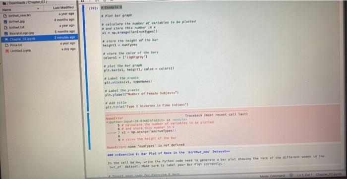
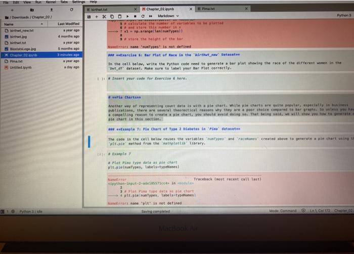
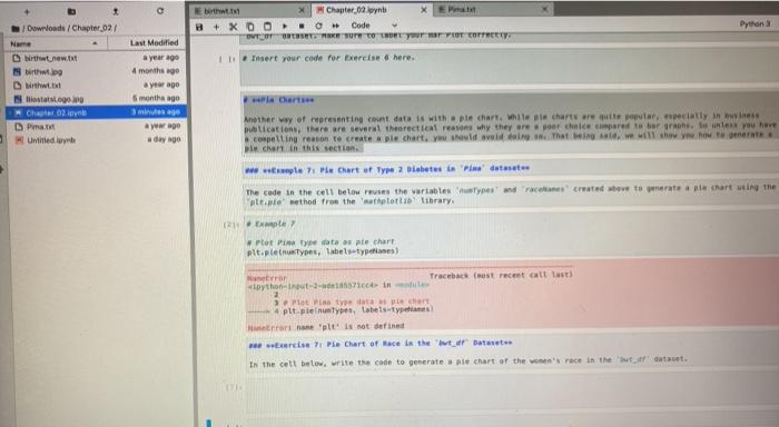
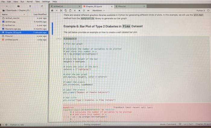
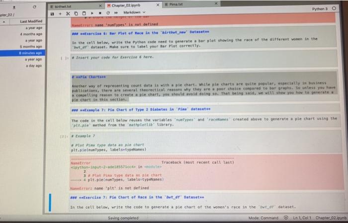
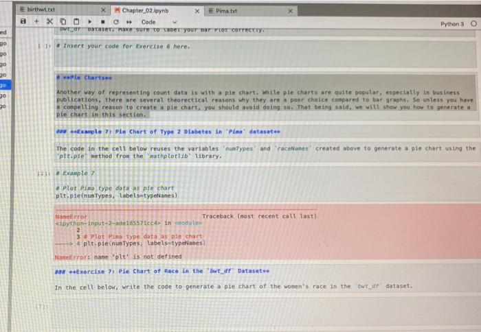
Last Modified Dow Chr/ Name Dhew.tw wg Bosley & months ago yewe mage 2 ar ago day we Datot Plat Bar arah cattate the ber of variables to be plotted and store Tube in 11 parangellennuslypes) are the height of the her Height types store the color of the nors colorst - Pray' plot the barra atlarini, height, color colors the- pit. Types) Label they pitylabelNumber of renal Subject Ad Title pittelype 2 Diabetes e Pendant Nane Traceback (most recent call lasti that it 3 came the best wart tette Store her in parangellennustyes! store the wint of the bar 'yesis not defined artis di Bar Pot of Hace in the Mirth Datest In the cell below, write the Python code need to generate a bar plot showing the race at the different women in the ut dataset. Make sure to tabel your bar Plot correctly. Edll View Karel Tabu Settings Help Ebit. X Chapter 02 pyeb Pintu Downloads Chapter 02/ B + XOOO Markdown Python Last Modified 5 calculate the number of variables the plotted 6 and store this bar in Diwtnew.ba a year ago - 7 1 - rp.arangeleninu Types two 4 months ago store the height at the bar birthwt. year ago Statslega. 5 months ago Haeunes! is not defined Cheute 02 Synd 3 minutes ago sercise Bar Met of Mace in the mirat new Datet. OPinma tut a year ago In the cell below, write the Python code need to generate bar plot showing the race of the different wonen in the Untitled a day ago "wt_df dataset. Make sure to tabel your Bar Plot correctly. I. Insert your code for Exercise here Chat Another way of representing count data is while ple charts are wite polar, especially in business publication, there are several theoretical reasons why they are a peor chaice compared to har grosso mess you he compelling on to create a nie chat you have done. That being with you to pie chart in this section pleie Chart of Type 2 Diabetes in Po dataset The cade in the cell below reuses the variables types and races created above to generate a pie chart using ptt.ne method from the athletih Library. Emple Plot type of sale chart plt.plentypes, labels-types anterar Traceback (most recent call last python-input-171coin 2 types pie chart pl. letu Types, tabels types molt is not defined Sang.comited 10 enna Mode Command in Col172.02 balS Eberth B + XD OTT Chapter 09 Wynb Code ORTASETE NIKE TYPOT COTTY. Python Last Modified Downloads / Chapter 02/ Name bitww.txt 19 brtt. Insert your code for Exercise here. ostats O 02 DP Untitled lyn a year ago 4 months a year ago 5 months ago iwego War ago day ago Ciert Another way of representing count date is with pie chart, while le charts are quite popular, especially in business publications, there are several theoretical reasons why they are poor chaice compared to bar rah. unless you here compelling reason to create le chart, you should do that it we will show you how to get Die chart in this section www . Pe Chart of Type 2 diabetes iela datasets The cade in the cell below rates the variables types and created ove to rate ale chart using the attie' method from the sathptorib library. Example Plot Pin ata os pie chart plt.plentyes, labels types Neror Traceback (most recent cit lasts python-inuti in Plot type specat 4 pit plenty, tabeis types Norte it is not defined Hercise 71 Pie Chart of Mace the Dataset In the cell below. write the code to generate a ple chart of the we're in the cat. Chapter 62 XD - More There we are different graphics fruies wat in Python for generating different kinds of plotis m, we will use the t.bar method from the attori library to generate our bar grooh Tilt Fist View Run Karmel Tabs Settings Help + Download Chapter 02/ Name Last Modified Ditaw. war ago Nbswt. & months ago tot yara Biostatslogo months ago MORADIO Ayo United.nl ad Example 6: Bar Plot of Type 2 Diabetes in Pima Dataset The cel below provide an example on how to create a well-tubeind bar pict Pot ar Kalestate her of varietate More this number 1 argetoniuses) on the height of the har Mighty #share the color of the Dars colors - 1 at the bar wraph plttar, height color court) belthew tarties, types el they ntylabor of reale Ad title Att.tit. Type PN Indian Norror Traceback (most recent call last) 102 calculate the varios tuottet SERI - parangelltype Sanged Mind Command Coil Cuptet 02 Pimatut Chapter 02 pynt Markdown Pythona pter 027 + XD O Last Modified year ago 4 months ago a year ago 5 months ago mine 90 #year ago a day ago untypes! is not defined i Bar Pet of Mace in the 'wirtvt_sew Best In the cell below, write the Python code need to generate bar plot showing the race of the different women in the I dettet. Make sure to label your tar Plot correctly. Insert your code for Exercise 6 here. PC Mother way of representing count data is with a pie chart. white pie charts are quite popular, socially in business publications, there are several theoretical reasons why they are poor choice compared to bor graphs so unless you have ing reason crestere chart. ym should avoid doing so. That being said shew you how to generate in chart in this section wwwple Pie Chart of Type 2 Diabetes in Pidataset The code to the cell below reuses the variables types' and 'races created above to generate ple chart using the platethed from the wholotti Library. 12 Ele Plot type data apie chart plt. (untypes, tabelstypenes Nor Traceback (most recent call last) python-571 in Hot type data pe chart plt.pienunTypes, labels types Naon nan pit' is not defined Exercise Ti Pie Chart of Race in the wt_df Datasetu In the cell below. write the code to generate a pie chart at the women's race in the out_ar dataset. Saving completed Mode Command in 1, Col1 Chapter 02.pinb E birtit.txt a + KOO OWTOT X Chapter 02 pynb X Eimart Dataset, ake sure to your rytor correctly. Code Python 3 O ed DO DO Insert your code for Exercise 6 here. 90 Pie Charts 30 30 Another way of representing count data is with a pie chart, white pie charts are quite popular, especially in business publications, there are several theoretical reasons why they are a poor choice compared to bar graphs. So untess you have o compelling reason to create a pie chart, you should avoid doing so. That being said, we will show you how to generate a pie chart in this section. *** **Example 7: Ple Chart of Type 2 diabetes in Plma dataset The code in the coll below reuses the variables "numtypes and raceNamen created above to generate a ple chart using the plt.ple method from the mathplotlib' library. 12) Example 7 Plot Piu type data as pie chart plt.pienunTypes, labelsetypeNames) Nanerror Traceback (most recent call last) cipython-input-2-ade185571cc> in modules 2 3. Plat Pane type data as pie chart - 4 plt.pienunTypes labels=typeNanes) NameError name 'plt is not defined *** Exercise 71 Pie Chart of Race in the wt_df Dataset In the cell below. write the code to generate a pie chart of the women's race in the but df dataset. Last Modified Dow Chr/ Name Dhew.tw wg Bosley & months ago yewe mage 2 ar ago day we Datot Plat Bar arah cattate the ber of variables to be plotted and store Tube in 11 parangellennuslypes) are the height of the her Height types store the color of the nors colorst - Pray' plot the barra atlarini, height, color colors the- pit. Types) Label they pitylabelNumber of renal Subject Ad Title pittelype 2 Diabetes e Pendant Nane Traceback (most recent call lasti that it 3 came the best wart tette Store her in parangellennustyes! store the wint of the bar 'yesis not defined artis di Bar Pot of Hace in the Mirth Datest In the cell below, write the Python code need to generate a bar plot showing the race at the different women in the ut dataset. Make sure to tabel your bar Plot correctly. Edll View Karel Tabu Settings Help Ebit. X Chapter 02 pyeb Pintu Downloads Chapter 02/ B + XOOO Markdown Python Last Modified 5 calculate the number of variables the plotted 6 and store this bar in Diwtnew.ba a year ago - 7 1 - rp.arangeleninu Types two 4 months ago store the height at the bar birthwt. year ago Statslega. 5 months ago Haeunes! is not defined Cheute 02 Synd 3 minutes ago sercise Bar Met of Mace in the mirat new Datet. OPinma tut a year ago In the cell below, write the Python code need to generate bar plot showing the race of the different wonen in the Untitled a day ago "wt_df dataset. Make sure to tabel your Bar Plot correctly. I. Insert your code for Exercise here Chat Another way of representing count data is while ple charts are wite polar, especially in business publication, there are several theoretical reasons why they are a peor chaice compared to har grosso mess you he compelling on to create a nie chat you have done. That being with you to pie chart in this section pleie Chart of Type 2 Diabetes in Po dataset The cade in the cell below reuses the variables types and races created above to generate a pie chart using ptt.ne method from the athletih Library. Emple Plot type of sale chart plt.plentypes, labels-types anterar Traceback (most recent call last python-input-171coin 2 types pie chart pl. letu Types, tabels types molt is not defined Sang.comited 10 enna Mode Command in Col172.02 balS Eberth B + XD OTT Chapter 09 Wynb Code ORTASETE NIKE TYPOT COTTY. Python Last Modified Downloads / Chapter 02/ Name bitww.txt 19 brtt. Insert your code for Exercise here. ostats O 02 DP Untitled lyn a year ago 4 months a year ago 5 months ago iwego War ago day ago Ciert Another way of representing count date is with pie chart, while le charts are quite popular, especially in business publications, there are several theoretical reasons why they are poor chaice compared to bar rah. unless you here compelling reason to create le chart, you should do that it we will show you how to get Die chart in this section www . Pe Chart of Type 2 diabetes iela datasets The cade in the cell below rates the variables types and created ove to rate ale chart using the attie' method from the sathptorib library. Example Plot Pin ata os pie chart plt.plentyes, labels types Neror Traceback (most recent cit lasts python-inuti in Plot type specat 4 pit plenty, tabeis types Norte it is not defined Hercise 71 Pie Chart of Mace the Dataset In the cell below. write the code to generate a ple chart of the we're in the cat. Chapter 62 XD - More There we are different graphics fruies wat in Python for generating different kinds of plotis m, we will use the t.bar method from the attori library to generate our bar grooh Tilt Fist View Run Karmel Tabs Settings Help + Download Chapter 02/ Name Last Modified Ditaw. war ago Nbswt. & months ago tot yara Biostatslogo months ago MORADIO Ayo United.nl ad Example 6: Bar Plot of Type 2 Diabetes in Pima Dataset The cel below provide an example on how to create a well-tubeind bar pict Pot ar Kalestate her of varietate More this number 1 argetoniuses) on the height of the har Mighty #share the color of the Dars colors - 1 at the bar wraph plttar, height color court) belthew tarties, types el they ntylabor of reale Ad title Att.tit. Type PN Indian Norror Traceback (most recent call last) 102 calculate the varios tuottet SERI - parangelltype Sanged Mind Command Coil Cuptet 02 Pimatut Chapter 02 pynt Markdown Pythona pter 027 + XD O Last Modified year ago 4 months ago a year ago 5 months ago mine 90 #year ago a day ago untypes! is not defined i Bar Pet of Mace in the 'wirtvt_sew Best In the cell below, write the Python code need to generate bar plot showing the race of the different women in the I dettet. Make sure to label your tar Plot correctly. Insert your code for Exercise 6 here. PC Mother way of representing count data is with a pie chart. white pie charts are quite popular, socially in business publications, there are several theoretical reasons why they are poor choice compared to bor graphs so unless you have ing reason crestere chart. ym should avoid doing so. That being said shew you how to generate in chart in this section wwwple Pie Chart of Type 2 Diabetes in Pidataset The code to the cell below reuses the variables types' and 'races created above to generate ple chart using the platethed from the wholotti Library. 12 Ele Plot type data apie chart plt. (untypes, tabelstypenes Nor Traceback (most recent call last) python-571 in Hot type data pe chart plt.pienunTypes, labels types Naon nan pit' is not defined Exercise Ti Pie Chart of Race in the wt_df Datasetu In the cell below. write the code to generate a pie chart at the women's race in the out_ar dataset. Saving completed Mode Command in 1, Col1 Chapter 02.pinb E birtit.txt a + KOO OWTOT X Chapter 02 pynb X Eimart Dataset, ake sure to your rytor correctly. Code Python 3 O ed DO DO Insert your code for Exercise 6 here. 90 Pie Charts 30 30 Another way of representing count data is with a pie chart, white pie charts are quite popular, especially in business publications, there are several theoretical reasons why they are a poor choice compared to bar graphs. So untess you have o compelling reason to create a pie chart, you should avoid doing so. That being said, we will show you how to generate a pie chart in this section. *** **Example 7: Ple Chart of Type 2 diabetes in Plma dataset The code in the coll below reuses the variables "numtypes and raceNamen created above to generate a ple chart using the plt.ple method from the mathplotlib' library. 12) Example 7 Plot Piu type data as pie chart plt.pienunTypes, labelsetypeNames) Nanerror Traceback (most recent call last) cipython-input-2-ade185571cc> in modules 2 3. Plat Pane type data as pie chart - 4 plt.pienunTypes labels=typeNanes) NameError name 'plt is not defined *** Exercise 71 Pie Chart of Race in the wt_df Dataset In the cell below. write the code to generate a pie chart of the women's race in the but df dataset
Step by Step Solution
There are 3 Steps involved in it

Get step-by-step solutions from verified subject matter experts