

Question: Python Programming in Jupyter Notebook. Don't worry too much about the data. Just want the structure and documentation of the code. Thank you! A D
Python Programming in Jupyter Notebook.
Don't worry too much about the data. Just want the structure and documentation of the code. Thank you!
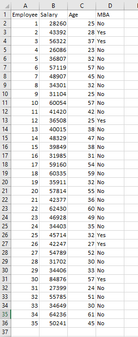
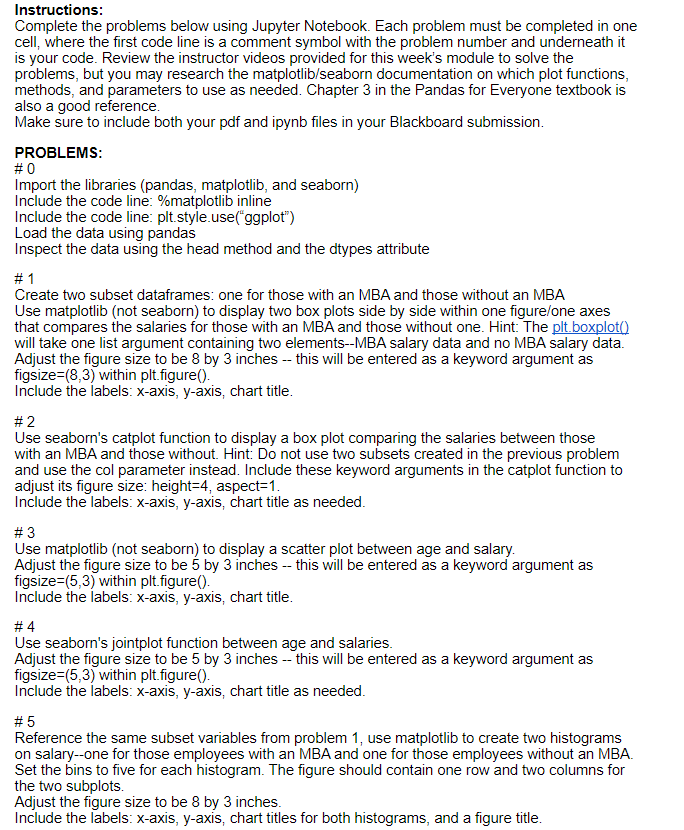
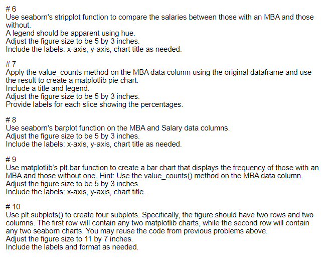
A D 8 11 B 1 Employee Salary Age 2 1 28260 3 2 43392 4 3 56322 5 4 26086 6 5 36807 7 6 57119 8 7 48907 9 34301 10 9 31104 11 10 60054 12 41420 13 12 36508 14 13 40015 15 14 48329 16 15 39849 17 16 31985 18 17 59160 19 60335 20 19 35911 21 57814 22 21 42377 23 22 62430 24 23 46928 25 24 34403 26 45714 27 26 42247 28 27 54789 29 28 31702 30 34406 31 30 84876 32 31 27399 33 32 55785 34 33 34649 35 34 64236 36 35 50241 37 MBA 25 No 28 Yes 37 Yes 23 No 32 No 57 No 45 No 32 No 25 No 57 No 42 No 25 Yes 38 No 47 No 38 No 31 No 54 No 59 No 32 No 55 No 36 No 60 No 49 No 35 No 32 Yes 27 Yes 52 No 30 No 33 No 57 Yes 24 No 51 No 30 No 61 No 45 No 18 20 25 29 Instructions: Complete the problems below using Jupyter Notebook. Each problem must be completed in one cell, where the first code line is a comment symbol with the problem number and underneath it is your code. Review the instructor videos provided for this week's module to solve the problems, but you may research the matplotlib/seaborn documentation on which plot functions, methods, and parameters to use as needed. Chapter 3 in the Pandas for Everyone textbook is also a good reference. Make sure to include both your pdf and ipynb files in your Blackboard submission. PROBLEMS: #0 Import the libraries (pandas, matplotlib, and seaborn) Include the code line: %matplotlib inline Include the code line: plt.style.use("ggplot") Load the data using pandas Inspect the data using the head method and the dtypes attribute # 1 Create two subset dataframes: one for those with an MBA and those without an MBA Use matplotlib (not seaborn) to display two box plots side by side within one figure/one axes that compares the salaries for those with an MBA and those without one. Hint: The plt.boxploto will take one list argument containing two elements--MBA salary data and no MBA salary data. Adjust the figure size to be 8 by 3 inches -- this will be entered as a keyword argument as figsize=(8,3) within plt.figure(). Include the labels: x-axis, y-axis, chart title. #2 Use seaborn's catplot function to display a box plot comparing the salaries between those with an MBA and those without. Hint: Do not use two subsets created in the previous problem and use the col parameter instead. Include these keyword arguments in the catplot function to adjust its figure size: height=4, aspect=1. Include the labels: x-axis, y-axis, chart title as needed. #3 Use matplotlib (not seaborn) to display a scatter plot between age and salary. Adjust the figure size to be 5 by 3 inches -- this will be entered as a keyword argument as figsize=(5,3) within plt figure(). Include the labels: x-axis, y-axis, chart title. #4 Use seaborn's jointplot function between age and salaries. Adjust the figure size to be 5 by 3 inches -- this will be entered as a keyword argument as figsize=(5,3) within plt.figure(). Include the labels: x-axis, y-axis, chart title as needed. #5 Reference the same subset variables from problem 1, use matplotlib to create two histograms on salary--one for those employees with an MBA and one for those employees without an MBA. Set the bins to five for each histogram. The figure should contain one row and two columns for the two subplots. Adjust the figure size to be 8 by 3 inches. Include the labels: x-axis, y-axis, chart titles for both histograms, and a figure title. #6 Use seaborn's stripplot function to compare the salaries between those with an MBA and those without A legend should be apparent using hue. Adjust the figure size to be 5 by 3 inches. Include the labels: x-axis, y-axis, chart title as needed. #7 Apply the value_counts method on the MBA data column using the original dataframe and use the result to create a matplotlib pie chart. Include a title and legend. Adjust the figure size to be 5 by 3 inches. Provide labels for each slice showing the percentages. #8 Use seaborn's barplot function on the MBA and Salary data columns. Adjust the figure size to be 5 by 3 inches. Include the labels: x-axis, y-axis, chart title as needed. #9 Use matplotlib's plt. bar function to create a bar chart that displays the frequency of those with an MBA and those without one. Hint: Use the value_counts() method on the MBA data column. Adjust the figure size to be 5 by 3 inches. Include the labels: x-axis, y-axis, chart title. # 10 Use plt.subplots() to create four subplots. Specifically, the figure should have two rows and two columns. The first row will contain any two matplotlib charts, while the second row will contain any two seaborn charts. You may reuse the code from previous problems above. Adjust the figure size to 11 by 7 inches. Include the labels and format as needed
Step by Step Solution
There are 3 Steps involved in it

Get step-by-step solutions from verified subject matter experts