

Question: Q. 7 Figure A represents a scatterplot constructed from the data; Figure B represents a regression line drawn through the scatterplot that fits the data
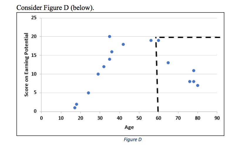
Q. 7 Figure A represents a scatterplot constructed from the data; Figure B represents a regression line drawn through the scatterplot that "fits" the data points reasonably well; Figure C represents an ellipse drawn around the data points.
a.What is the overall direction of the correlation? ___
b.Estimate the strength of the correlation coefficient: ___
c.Using only the data points associated with age of 60 and above; what effect does this have on the direction and strength of the correlation coefficient?
d.Explain why this is the case.
e.Why is it beneficial to examine truncated parts of this graph instead of the graph as a whole?
f.Identify how likely it is that a causal relationship has been indicated.
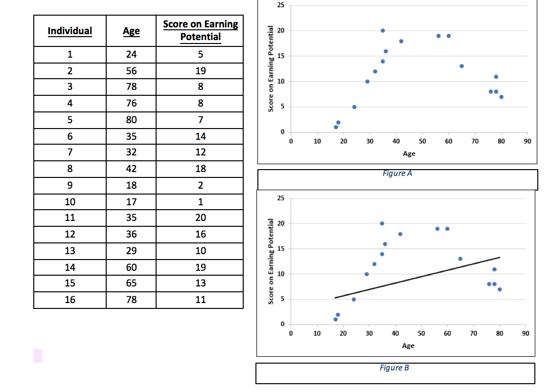
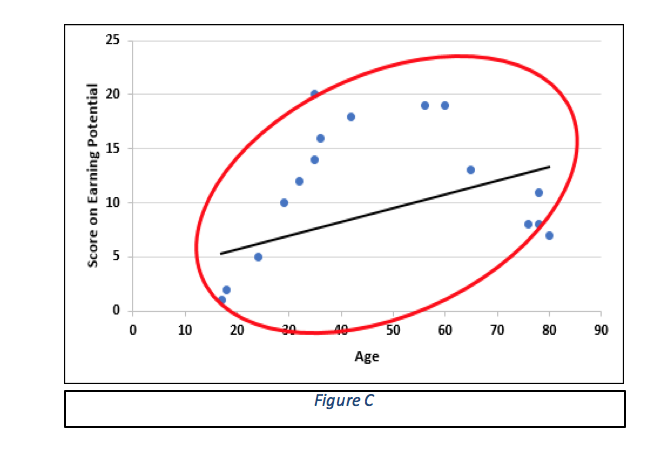
25 Individual Age Score on Earning Potential 20 24 5 15 W N 56 19 78 8 10 . 76 8 5 UT Score on Earning Potential 80 7 35 14 0 32 10 20 30 12 40 50 60 70 80 90 Age 42 18 18 2 Figure A 10 17 1 25 11 35 20 12 20 36 16 13 29 10 15 14 60 19 15 65 13 10 16 78 11 Score on Earning Potential 10 20 30 40 50 60 70 80 90 Age Figure B\f\f
Step by Step Solution
There are 3 Steps involved in it

Get step-by-step solutions from verified subject matter experts