

Question: QSO 320 Milestone One Guidelines and Rubric Overview Finding out about organizational inefficiencies is the first step to improving performance. To determine what inefficiencies exist,
QSO 320 Milestone One Guidelines and Rubric
Overview
Finding out about organizational inefficiencies is the first step to improving performance. To determine what inefficiencies exist, you need to perform a data analysis. A good place to start is with sales. You have to know what data to study and how to use specific tools for data analysis. Its important to use the IF function, pivot tables, pie charts, bar charts, and histograms. These can help you isolate specific data and organize it in a way that makes it easier to read. Studying measures of central tendency also helps you find out important information. First, you find where inefficiencies in sales exist. Then, you need to be able to talk about the effect this has on the organization.
Directions
For this assignment, youll use the Vinho Winery Scenario, linked in Supporting Materials, and other course resources to look at raw data sets. These data sets will explain the production, sales, and distribution of wine. Youll need to study the different types of wine and distribution centers to figure out their financial effects on the organizations total profits. All your analyses need to be submitted in an annotated Excel file, and each analysis needs to include your reasons for using the appropriate Excel functions.
Specifically, you must address the following rubric criteria:
- Using a pivot table, figure out the percentage of wine varieties sold from each distribution center. Show your results in the form of a pie chart.
- Hint: Create a pivot table using the data spreadsheet as a starting point.
- Create a labeled bar chart that shows the amount of wine varieties sold to each distribution center.
- Use the pivot table already created to calculate the total amount of revenue made for each distribution center. Show your results in a bar chart.
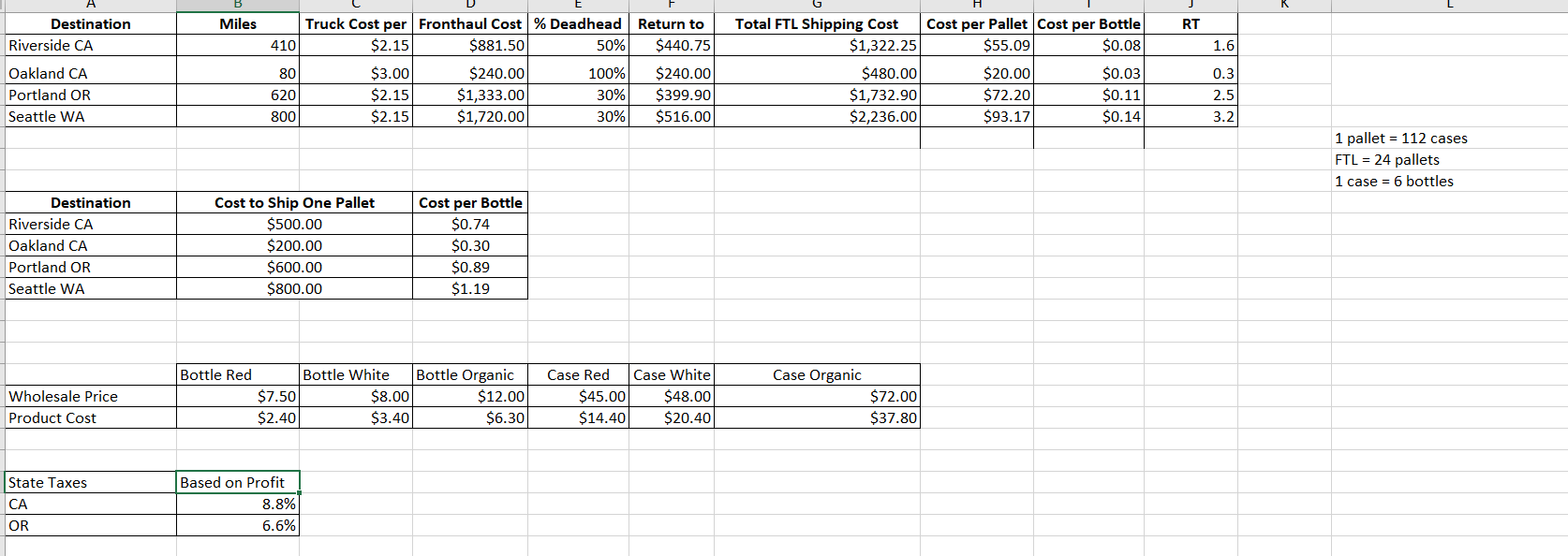
- Hint: Production cost data is provided in the Costs & Distances tab. Make sure you dont mix your units of measurement (i.e., pallets, cases, or bottles).
- Use the IF function to calculate the central tendencies (mean, median, and mode) of shipment volume for each distribution center. Show your results in a table. (Do NOT use a pivot table or manually identify each cell to be evaluated.)
- Analyze the frequency of shipment by size using a histogram. Use the following bin sizes (number of pallets): 72, 48, 24, 18, 12, 6, 3, 1.
- Create a shipment histogram to show the distribution of shipments for Portland and Riverside. Use the same bin sizes as you did in step five.
- Hint: Use the alphabetical sort for the destination column. Then select Data Analysis to plot the frequency of pallet shipments using the bin sizes listed for the two destinations separately.
- Write a summary statement that describes the inefficiencies shown in the organizational sales analysis. In your response, explain why this information is important for influencing management decisions.
- ]
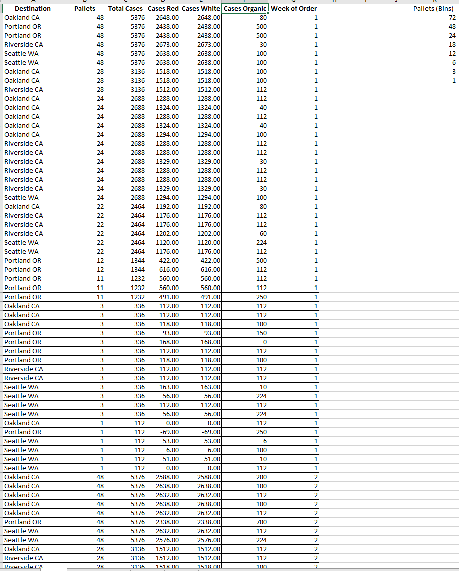
Data Sheet in excel
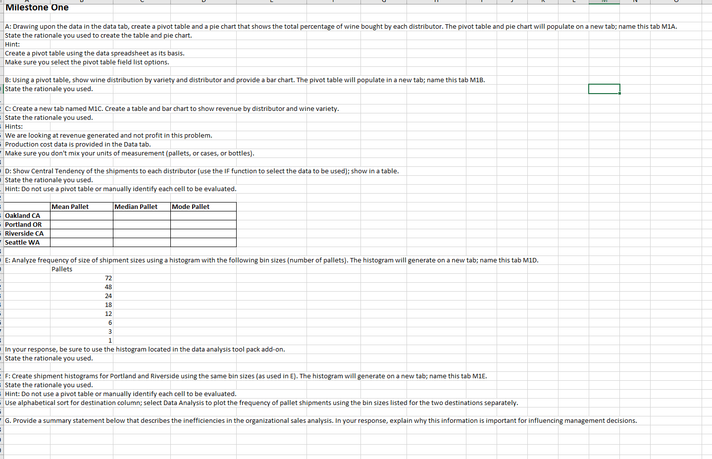
Milestone One State the rationale you used to create the table and pie chart. Hint: Create a pivot table using the data spreadsheet as its basis. Make sure you select the pivot table field list options. B: Using a pivot table, show wine distribution by variety and distributor and provide a bar chart. The pivot table will populate in a new tab; name this tab M1B. State the rationale you used. C: Create a new tab named M1C. Create a table and bar chart to show revenue by distributor and wine variety. State the rationale you used. Hints: We are looking at revenue generated and not profit in this problem. Production cost data is provided in the Data tab. Make sure you don't mix your units of measurement (pallets, or cases, or bottles). D: Show Central Tendency of the shipments to each distributor (use the If function to select the data to be used); show in a table. State the rationale you used. Hint: Do not use a pivot table or manually identify each cell to be evaluated. \begin{tabular}{|l|l|l|l|} \hline & Mean Pallet & Median Pallet & Mode Pallet \\ \hline Oakland CA & & & \\ \hline Portland OR & & & \\ \hline Riverside CA & & & \\ \hline Seattle WA & & & \\ \hline \end{tabular} E: Analyze frequency of size of shipment sizes using a histogram with the following bin sizes (number of pallets). The histogram will generate on a new tab; name this tab M1D. Pallets \begin{tabular}{|r|r|r|} \hline 72 & & \\ \hline 48 & & \\ \hline 24 & \\ \hline 18 & \\ 12 & \\ \hline 6 & \\ \hline 3 & \\ \hline 1 & \\ \hline \end{tabular} In your response, be sure to use the histogram located in the data analysis tool pack add-on. State the rationale you used. F: Create shipment histograms for Portland and Riverside using the same bin sizes (as used in E). The histogram will generate on a new tab; name this tab M1E. State the rationale you used. Hint: Do not use a pivot table or manually identify each cell to be evaluated. Use alphabetical sort for destination column; select Data Analysis to plot the frequency of pallet shipments using the bin sizes listed for the two destinations separately
Step by Step Solution
There are 3 Steps involved in it

Get step-by-step solutions from verified subject matter experts