Question: Question 1 . 6 . Construct an appropriate visualization to compare the distribution of the number of events across different days of the week, sorted
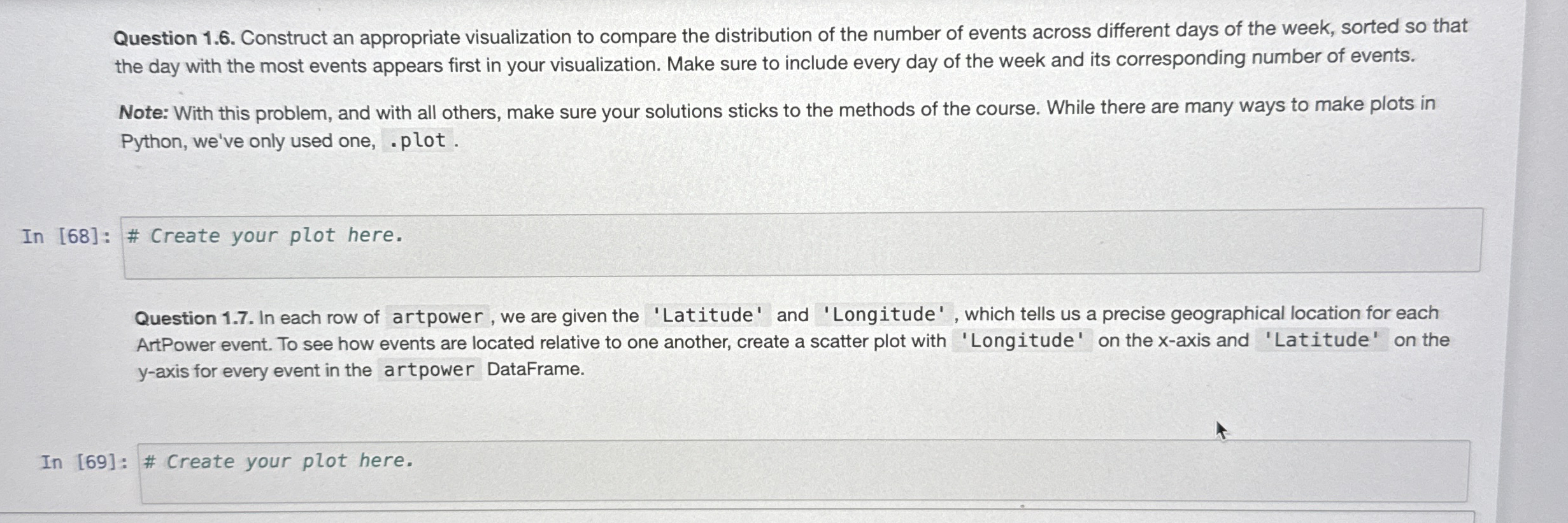
Question Construct an appropriate visualization to compare the distribution of the number of events across different days of the week, sorted so that the day with the most events appears first in your visualization. Make sure to include every day of the week and its corresponding number of events.
Note: With this problem, and with all others, make sure your solutions sticks to the methods of the course. While there are many ways to make plots in Python, we've only used one, plot.
In : # Create your plot here.
Question In each row of artpower, we are given the 'Latitude' and 'Longitude' which tells us a precise geographical location for each ArtPower event. To see how events are located relative to one another, create a scatter plot with 'Longitude' on the axis and 'Latitude' on the axis for every event in the artpower DataFrame.
In : # Create your plot here.

Step by Step Solution
There are 3 Steps involved in it
1 Expert Approved Answer
Step: 1 Unlock


Question Has Been Solved by an Expert!
Get step-by-step solutions from verified subject matter experts
Step: 2 Unlock
Step: 3 Unlock


