

Question: Question 14 Please use these graphs to answer the next questions. In each graph, the vertical axis represents the price of BP in $ and
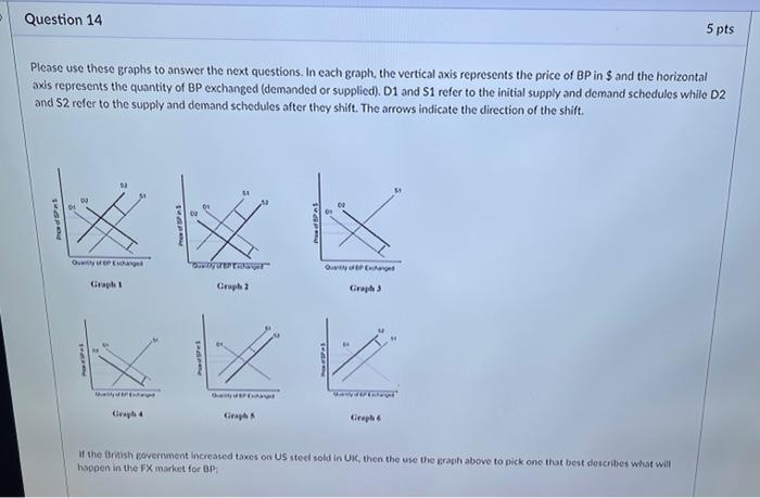
Question 14 Please use these graphs to answer the next questions. In each graph, the vertical axis represents the price of BP in $ and the horizontal axis represents the quantity of BP exchanged (demanded or supplied). D1 and S1 refer to the initial supply and demand schedules while D2 and 52 refer to the supply and demand schedules after they shift. The arrows indicate the direction of the shift. ProSpe Quantity of en Exchanged Graph 1 Parfe Qytet Graph 4 SHAPING "Outyder Hager Graph 2 SHAARE Graph Preed Dat Qusty of EP Exchange Graph 3 Savydi Enday Graph 6 5 pts If the British government increased taxes on US steel sold in UK, then the use the graph above to pick one that best describes what will happen in the FX market for BP
Step by Step Solution
There are 3 Steps involved in it

Get step-by-step solutions from verified subject matter experts