

Question: Question 7 A study was conducted to determine how people get jobs. The table below lists data from 400 randomly selected subjects. Job Sources Frequency
Question 7
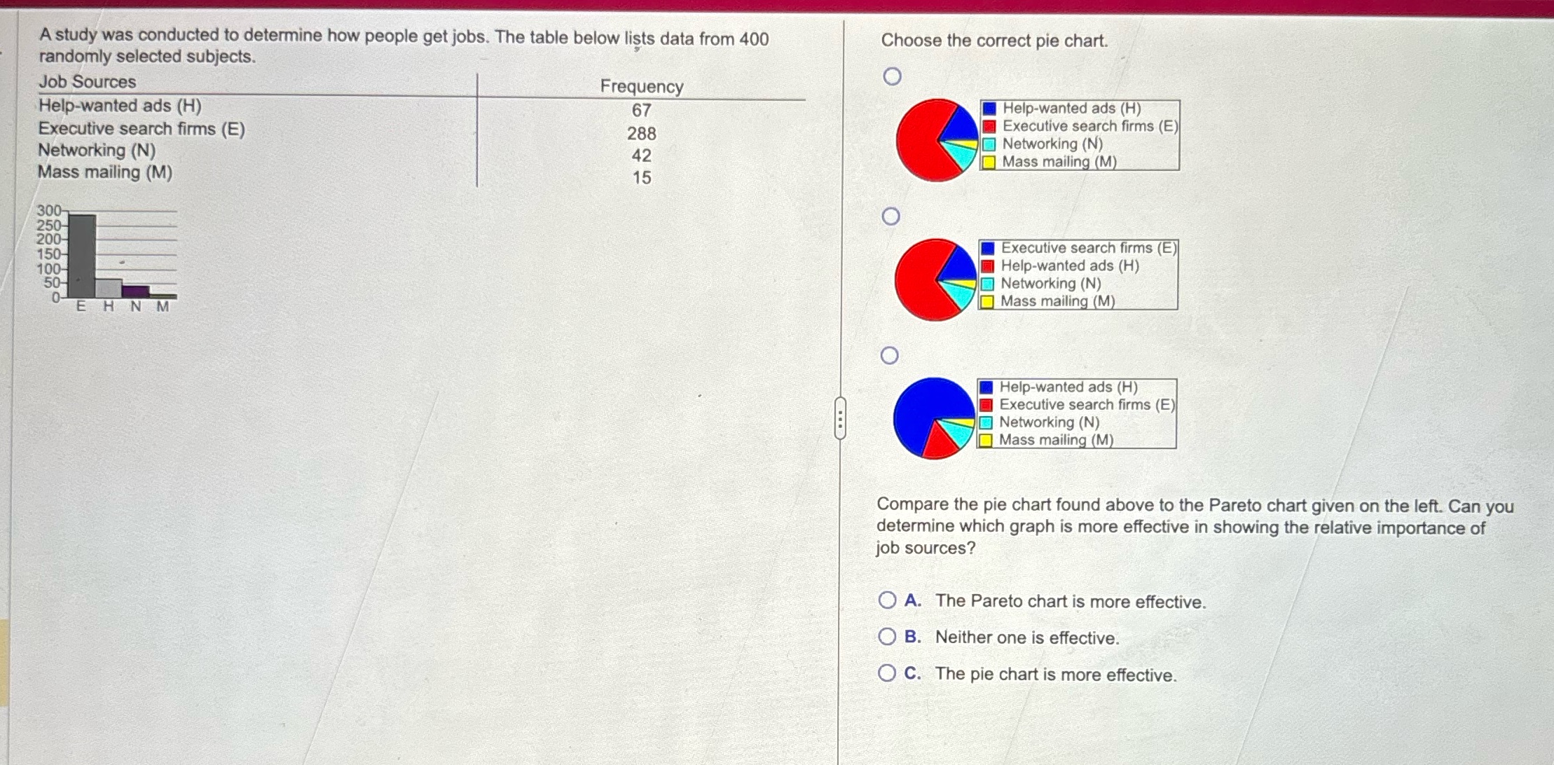
A study was conducted to determine how people get jobs. The table below lists data from 400 randomly selected subjects. Job Sources Frequency Help-wanted ads (H) 67 Executive search firms (E) 288 Networking (N) 42 Mass mailing (M) 15 300 250 200 150 Choose the correct pie chart. o M Help-wanted ads (H) Il Executive search firms (E) Networking (N) Mass mailing (M [l Executive search firms (E)| [l Help-wanted ads (H) [ Networking (N) Mass mailing (M [l Help-wanted ads (H) Il Executive search firms (E) [E Networking (N) Mass mailing (M Compare the pie chart found above to the Pareto chart given on the left. Can you determine which graph is more effective in showing the relative importance of job sources? O A. The Pareto chart is more effective. (O B. Neither one is effective. O C. The pie chart is more effective
Step by Step Solution
There are 3 Steps involved in it

Get step-by-step solutions from verified subject matter experts