

Question: Question Response What do these visualizations show? How might these observations affect our risk assessment? What types of procedures can be performed to evaluate what
| Question | Response |
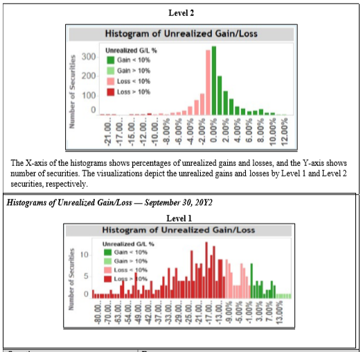
| What do these visualizations show? |
|
| How might these observations affect our risk assessment? |
|
| What types of procedures can be performed to evaluate what we are seeing relative to unrealized losses in the Level 1 securities? |
|
Level 2 Histogram of Unrealized Gain/Loss Unrealized G/L % Gain 10% Loss 10% 300 200 100 Number of Securities 0 -21.00 -17.00 -15.00 -12.00 -10.00.. -8.00% -6.00% -4.00% 10.00% 12.00% The X-axis of the histograms shows percentages of unrealized gains and losses, and the Y-axis shows number of securities. The visualizations depict the unrealized gains and losses by Level 1 and Level 2 securities, respectively. Histograms of Unrealized Gain/Loss September 30, 2012 Level 1 Histogram of Unrealized Gain/Loss Unrealized G/L Gain 10% Number of Securities Gain > 10% Loss 30% 104 olumlu 00 09 -54.00. 49.00 42.00 37.00 33.00 -29.00 -25.00 -21.00 -17.00 13.00 -9.00% -5.00% -1.00% 3.00% 7.00% 13.00%
Step by Step Solution
There are 3 Steps involved in it

Get step-by-step solutions from verified subject matter experts