

Question: R-Studio programming: I have programmed this code here in R Studio. Here the stock prices from Yahoo Finance are loaded and the maximum drawdown of
R-Studio programming:
I have programmed this code here in R Studio.
Here the stock prices from Yahoo Finance are loaded and the maximum drawdown of the stock is calculated.
But I want to have a better looked maximum drawdown chart like the right picture.
Could you improve my R-Studio Code:
# add drawdown to each date nfdd % arrange(date) %>% mutate(drawdown=adjusted-lag(adjusted)) # calculate mean drawdown meandd =0 to 0 nfdd2 % mutate(drawdown = ifelse(drawdown>=0, 0, drawdown)) meandd2 % ggplot(aes(x = date, y = drawdown)) + geom_line(color="blue", alpha=0.7) + ggtitle("Netflix drawdown since 2009") + labs(x = "Date", "Drawdown") + scale_x_date(date_breaks = "years", date_labels = "%Y") + labs(x = "Date", y = "Drawdown") + scale_y_continuous(limits = c(-10, 0)) + geom_hline(yintercept=meandd2, linetype="dashed", color="red", size=1)+ theme_bw()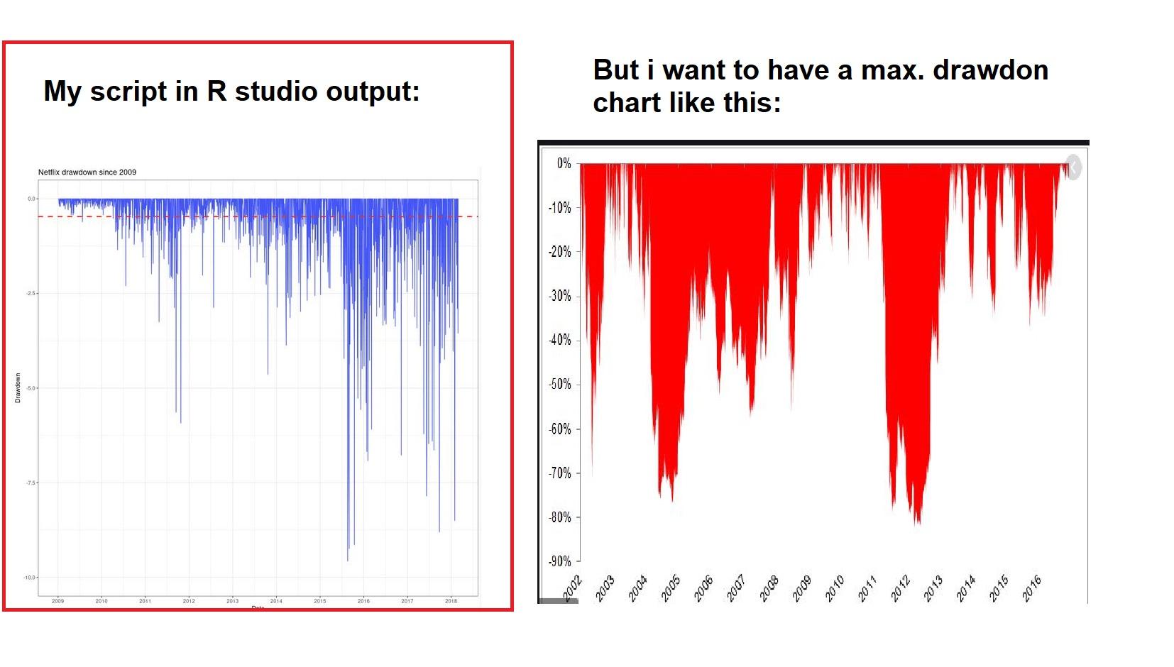
My script in R studio output: But i want to have a max. drawdon chart like this: 0% Netflix drawdown since 2009 -10% -20% 2.5 -30% 40% -50% -60% -70% 25 -80% -90% 2007 2003 2004 2005 2006 2007 2008 2009 2010 2011 2012 2013 Bloc 2015 2016 2010 2011 2012 2013 2014 2015 2016 2018 D My script in R studio output: But i want to have a max. drawdon chart like this: 0% Netflix drawdown since 2009 -10% -20% 2.5 -30% 40% -50% -60% -70% 25 -80% -90% 2007 2003 2004 2005 2006 2007 2008 2009 2010 2011 2012 2013 Bloc 2015 2016 2010 2011 2012 2013 2014 2015 2016 2018 D
Step by Step Solution
There are 3 Steps involved in it

Get step-by-step solutions from verified subject matter experts