

Question: Step 1 : Adding your data in Excel Here is an example of how you may plot your data in Excel. If you prefer any
Step : Adding your data in Excel
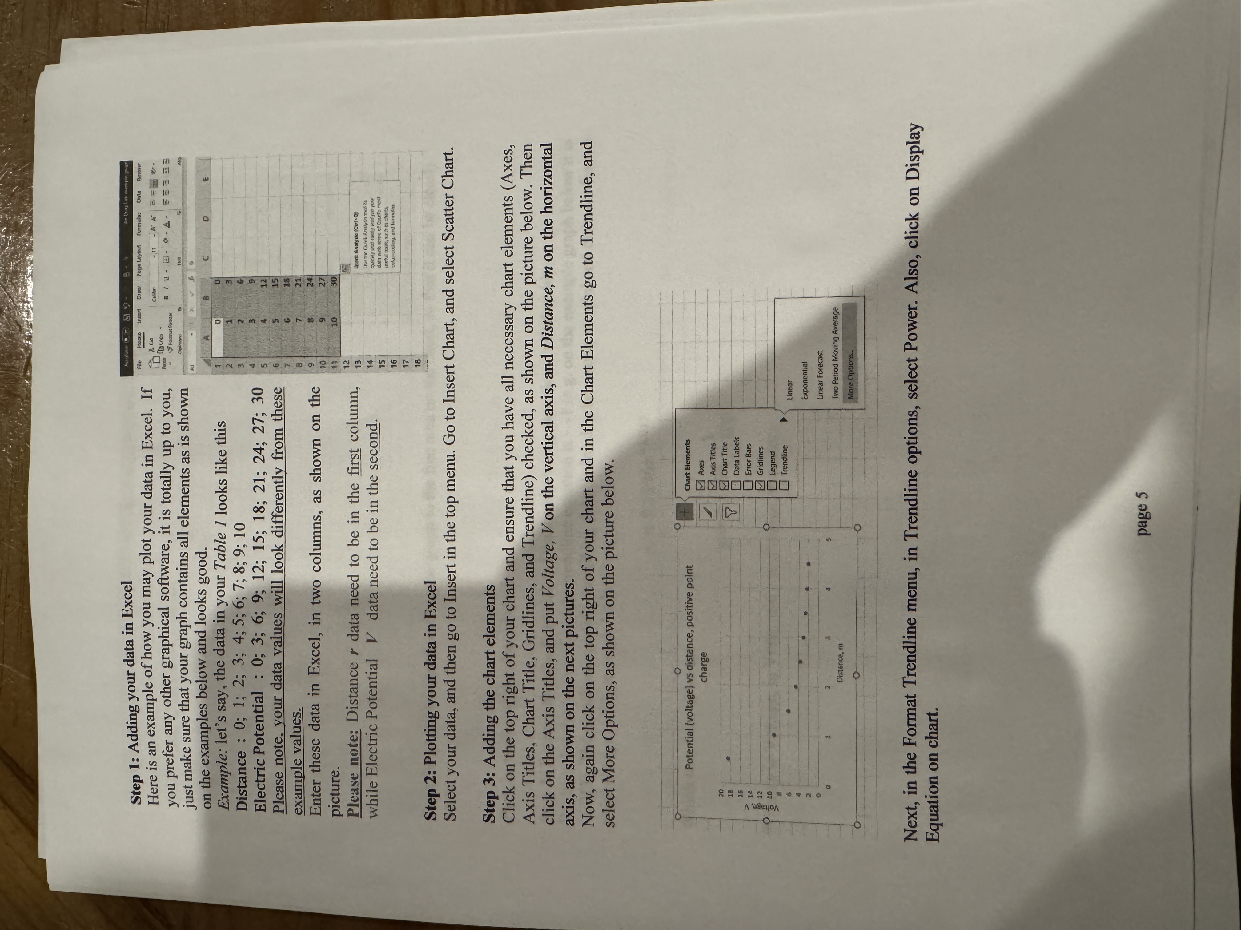
Here is an example of how you may plot your data in Excel. If you prefer any other graphical software, it is totally up to you, just make sure that your graph contains all elements as is shown on the examples below and looks good.
Example: let's say, the data in your Table looks like this
Distance : ;;;;;;;;;;
Electric Potential : ;;;;;;;;;;
Please note, your data values will look differently from these example values.
Enter these data in Excel, in two columns, as shown on the picture.
Please note: Distance data need to be in the first column, while Electric Potential data need to be in the second.
Step : Plotting your data in Excel
Select your data, and then go to Insert in the top menu. Go to Insert Chart, and select Scatter Chart.
Step : Adding the chart elements
Click on the top right of your chart and ensure that you have all necessary chart elements Axes Axis Titles, Chart Title, Gridlines, and Trendline checked, as shown on the picture below. Then click on the Axis Titles, and put Voltage, on the vertical axis, and Distance, on the horizontal axis, as shown on the next pictures.
Now, again click on the top right of your chart and in the Chart Elements go to Trendline, and select More Options, as shown on the picture below.
Next, in the Format Trendline menu, in Trendline options, select Power. Also, click on Display Equation on chart.
page
Step by Step Solution
There are 3 Steps involved in it
1 Expert Approved Answer
Step: 1 Unlock

Question Has Been Solved by an Expert!
Get step-by-step solutions from verified subject matter experts
Step: 2 Unlock
Step: 3 Unlock