

Question: The data on the worksheet titled Problem 4 contains information regarding the production values for four large vehicle manufacturers over a five-year period. The instructions
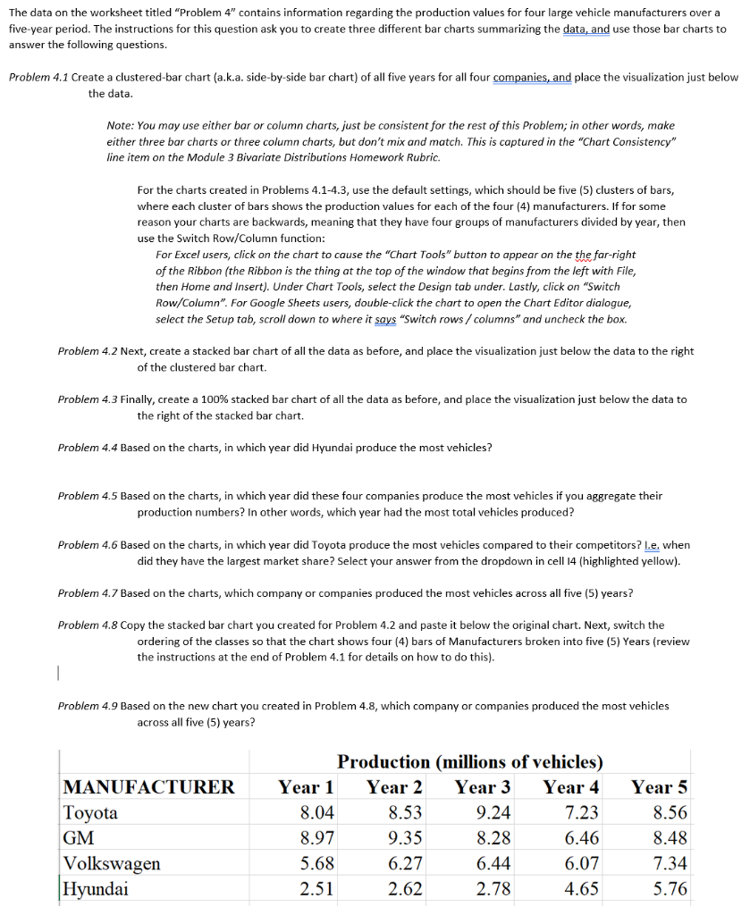
The data on the worksheet titled "Problem 4" contains information regarding the production values for four large vehicle manufacturers over a five-year period. The instructions for this question ask you to create three different bar charts summarizing the data, and use those bar charts to answer the following questions. Problem 4.1 Create a clustered-bar chart (a.k.a. side-by-side bar chart) of all five years for all four companies, and place the visualization just below the data. Note: You may use either bar or column charts, just be consistent for the rest of this problem; in other words, make either three bar charts or three column charts, but don't mix and match. This is captured in the "Chart Consistency" line item on the Module 3 Bivariate Distributions Homework Rubric. For the charts created in Problems 4.1-4.3, use the default settings, which should be five (5) clusters of bars, where each cluster of bars shows the production values for each of the four (4) manufacturers. If for some reason your charts are backwards, meaning that they have four groups of manufacturers divided by year, then use the Switch Row/Column function: For Excel users, click on the chart to cause the "Chart Tools" button to appear on the the far-right of the Ribbon (the Ribbon is the thing at the top of the window that begins from the left with File, then Home and Insert). Under Chart Tools, select the Design tab under. Lastly, click on "Switch Row/Column".For Google Sheets users, double-click the chart to open the Chart Editor dialogue, select the Setup tab, scroll down to where it says "Switch rows / columns" and uncheck the box. Problem 4.2 Next, create a stacked bar chart of all the data as before, and place the visualization just below the data to the right of the clustered bar chart. Problem 4.3 Finally, create a 100% stacked bar chart of all the data as before, and place the visualization just below the data to the right of the stacked bar chart. Problem 4.4 Based on the charts, in which year did Hyundai produce the most vehicles? Problem 4.5 Based on the charts, in which year did these four companies produce the most vehicles if you aggregate their production numbers? In other words, which year had the most total vehicles produced? Problem 4.6 Based on the charts, in which year did Toyota produce the most vehicles compared to their competitors? I.e. when did they have the largest market share? Select your answer from the dropdown in cell 14 (highlighted yellow). Problem 4.7 Based on the charts, which company or companies produced the most vehicles across all five (5) years? Problem 4.8 Copy the stacked bar chart you created for Problem 4.2 and paste it below the original chart. Next, switch the ordering of the classes so that the chart shows four (4) bars of Manufacturers broken into five (5) Years (review the instructions at the end of Problem 4.1 for details on how to do this). 1 Problem 4.9 Based on the new chart you created in Problem 4.8, which company or companies produced the most vehicles across all five (5) years? MANUFACTURER Toyota GM Volkswagen Hyundai Production (millions of vehicles) Year 1 Year 2 Year 3 Year 4 8.04 8.53 9.24 7.23 8.97 9.35 8.28 6.46 5.68 6.27 6.44 6.07 2.51 2.62 2.78 4.65 Year 5 8.56 8.48 7.34 5.76 The data on the worksheet titled "Problem 4" contains information regarding the production values for four large vehicle manufacturers over a five-year period. The instructions for this question ask you to create three different bar charts summarizing the data, and use those bar charts to answer the following questions. Problem 4.1 Create a clustered-bar chart (a.k.a. side-by-side bar chart) of all five years for all four companies, and place the visualization just below the data. Note: You may use either bar or column charts, just be consistent for the rest of this problem; in other words, make either three bar charts or three column charts, but don't mix and match. This is captured in the "Chart Consistency" line item on the Module 3 Bivariate Distributions Homework Rubric. For the charts created in Problems 4.1-4.3, use the default settings, which should be five (5) clusters of bars, where each cluster of bars shows the production values for each of the four (4) manufacturers. If for some reason your charts are backwards, meaning that they have four groups of manufacturers divided by year, then use the Switch Row/Column function: For Excel users, click on the chart to cause the "Chart Tools" button to appear on the the far-right of the Ribbon (the Ribbon is the thing at the top of the window that begins from the left with File, then Home and Insert). Under Chart Tools, select the Design tab under. Lastly, click on "Switch Row/Column".For Google Sheets users, double-click the chart to open the Chart Editor dialogue, select the Setup tab, scroll down to where it says "Switch rows / columns" and uncheck the box. Problem 4.2 Next, create a stacked bar chart of all the data as before, and place the visualization just below the data to the right of the clustered bar chart. Problem 4.3 Finally, create a 100% stacked bar chart of all the data as before, and place the visualization just below the data to the right of the stacked bar chart. Problem 4.4 Based on the charts, in which year did Hyundai produce the most vehicles? Problem 4.5 Based on the charts, in which year did these four companies produce the most vehicles if you aggregate their production numbers? In other words, which year had the most total vehicles produced? Problem 4.6 Based on the charts, in which year did Toyota produce the most vehicles compared to their competitors? I.e. when did they have the largest market share? Select your answer from the dropdown in cell 14 (highlighted yellow). Problem 4.7 Based on the charts, which company or companies produced the most vehicles across all five (5) years? Problem 4.8 Copy the stacked bar chart you created for Problem 4.2 and paste it below the original chart. Next, switch the ordering of the classes so that the chart shows four (4) bars of Manufacturers broken into five (5) Years (review the instructions at the end of Problem 4.1 for details on how to do this). 1 Problem 4.9 Based on the new chart you created in Problem 4.8, which company or companies produced the most vehicles across all five (5) years? MANUFACTURER Toyota GM Volkswagen Hyundai Production (millions of vehicles) Year 1 Year 2 Year 3 Year 4 8.04 8.53 9.24 7.23 8.97 9.35 8.28 6.46 5.68 6.27 6.44 6.07 2.51 2.62 2.78 4.65 Year 5 8.56 8.48 7.34 5.76
Step by Step Solution
There are 3 Steps involved in it

Get step-by-step solutions from verified subject matter experts