

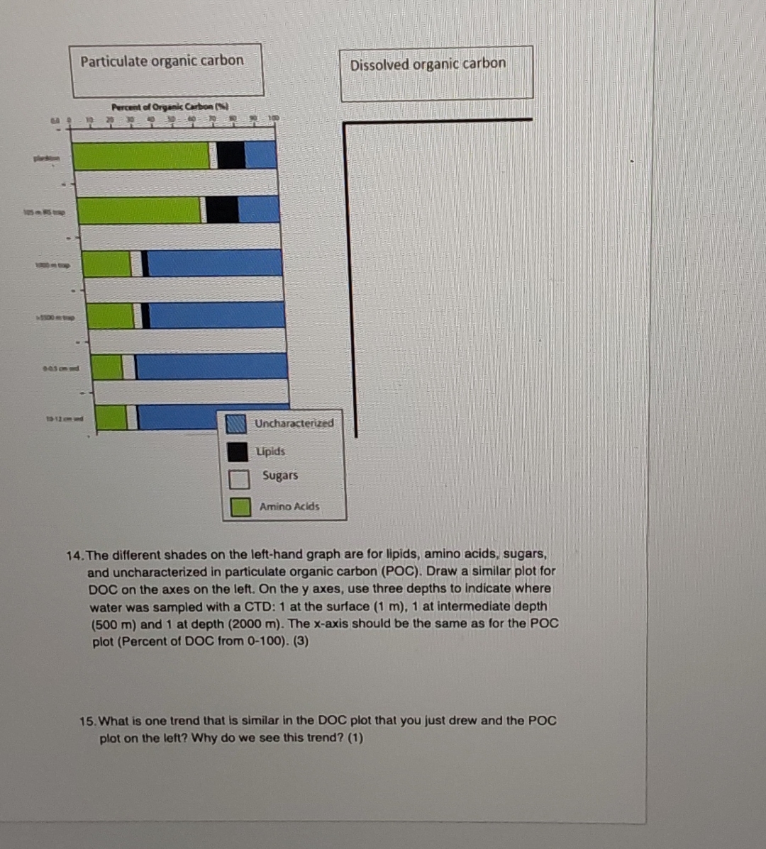
Question: The different shades on the left - hand graph are for lipids, amino acids, sugars, and uncharacterized in particulate organic carbon ( POC ) .
The different shades on the lefthand graph are for lipids, amino acids, sugars, and uncharacterized in particulate organic carbon POC Draw a similar plot for DOC on the axes on the left. On the axes, use three depths to indicate where water was sampled with a CTD: at the surface at intermediate depth and at depth The axis should be the same as for the POC plot Percent of DOC from
What is one trend that is similar in the DOC plot that you just drew and the POC plot on the left? Why do we see this trend?
Step by Step Solution
There are 3 Steps involved in it
1 Expert Approved Answer
Step: 1 Unlock

Question Has Been Solved by an Expert!
Get step-by-step solutions from verified subject matter experts
Step: 2 Unlock
Step: 3 Unlock