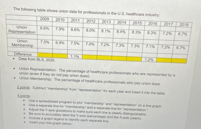
Question: The following table shows union data for professionals in the U.S. healthcare industry 2009 2010 2011 2012 2013 2014 2015 2016 2017 2018 Union Representation

The following table shows union data for
The following table shows union data for professionals in the U.S. healthcare industry 2009 2010 2011 2012 2013 2014 2015 2016 2017 2018 Union Representation 8.6% 7.9% 8.6% 8.0% 8.1% 8.4% 8.3% 8.3% 7.2% 6.7% Union Membership 7.5% 6.9% 7.5% 7.0% 7.2% 7.3% 7.3% 7.1% 7.2% 6.7% Difference Data from BLS, 2020. 1.1% 1.2% . Union Representation: The percentage of healthcare professionals who are represented by a union (even if they do not pay union dues). Union Membership: The percentage of healthcare professionals who pay union dues. 2 points: Subtract "membership" from "representation" for each year and insert it into the table. 4 points Use a spreadsheet program to plot "membership and representation on a line graph. Use a separate line for membership and a separate line for "representation Adjust the Y-axis gradations to make sure each line is clearly distinguishable Be sure to accurately label the Y-axis (percentage) and the X-axis (years). Include a graph legend to identify each separate line Insert your line graph below

Step by Step Solution

There are 3 Steps involved in it

1 Expert Approved Answer
Step: 1 Unlock blur-text-image
Question Has Been Solved by an Expert!

Get step-by-step solutions from verified subject matter experts

Step: 2 Unlock
Step: 3 Unlock

Students Have Also Explored These Related General Management Questions!