

Question: The frequency plot (histogram) below shows the population of the United States in 2010 and 2019 differentiated by sex and age. Please review it and
The frequency plot (histogram) below shows the population of the United States in 2010 and 2019 differentiated by sex and age. Please review it and state at least three (3) significant observations or conclusions that you can make about the US population in general, the trends indicated by the changes from 2010 to 2019, the differences in the population by sex and/or age, etc. Justify your observation or conclusion using information from the graph.
When you review and comment on your fellow student's posts, please state whether you agree, disagree, or how you would modify their observations or conclusions. Et
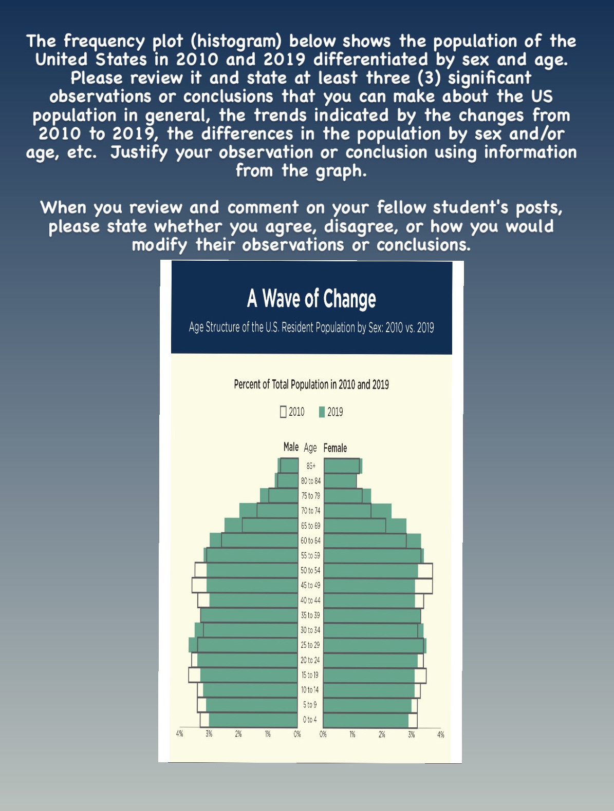
The frequency plot (histogram) below shows the population of the United States in 2010 and 2019 differentiated by sex and age. Please review it and state at least three (3) significant observations or conclusions that you can make about the US population in general, the trends indicated by the changes from 2010 to 2019, the differences in the population by sex and/or age, etc. Justify your observation or conclusion using information from the graph. When you review and comment on your fellow student's posts, please state whether you agree, disagree, or how you would modify their observations or conclusions. A Wave of Change Age Structure of the U.S. Resident Population by Sex: 2010 vs. 2019 Percent of Total Population in 2010 and 2019 2010 2019 Male Age Female 85+ 30 to 84 75 to 79 70 to 74 65 to 69 60 to 64 55 to 59 50 to 54 15 to 49 40 to 44 35 to 39 50 to 34 25 to 29 20 to 2 15 to 19 0 to 1 5 to 9 0 to 4% 3% 2% 1% 2%6 3%
Step by Step Solution
There are 3 Steps involved in it

Get step-by-step solutions from verified subject matter experts