

Question: The tools practiced in this workshop are: 5 whys/why-why analysis Cause-and-effect diagrams Pareto charts Situation: Consider that you work for a consumer advocate agency. You
The tools practiced in this workshop are:
5 whys/why-why analysis
Cause-and-effect diagrams
Pareto charts
Situation: Consider that you work for a consumer advocate agency. You have been tasked with helping families lower their electricity bills. In the Analyze phase of your Lean Six Sigma project, you decide to investigate potential causes for high residential electricity bills. For this, you plan to use 5 whys/why-why analysis in conjunction with a cause-and-effect diagram. Then, you will collect data (you will use a data sheet in Workshop Resources) about the most significant potential causes of your problem and make a Pareto chart to determine the leading cause of this problem.
Project Title: Reduce the cost of residential electricity bills.
Problem Statement: Residential electricity bills are too high. This causes hardships to families who need the money to buy food and pay other bills.
Mission Statement: The goal of the project is to reduce residential electricity bills. By reducing these bills money will be freed up to pay for food and shelter and other critical services
After completing your cause-and-effect diagram, reflect on all the items listed and select what you believe are the top five potential causes of the problem (these can be causes, sub-causes, and/or sub-sub-causes). You must label these with the numbers 1-5, where "1" represents what you believe is the leading cause of the problem on the Cause and Effect diagram. Then, obtain the file Pareto Chart Workshop Data.xls from Blackboard. This file is meant to simulate the process of you collecting data about the top 5 causes of your problem. Pretend the data in this file was collected from electricity usage data, with causes being tracked. The data in this file are already "coded" for you, so all you need to do is fill-in the "key" (based on the items you labeled 1-5 in your cause-and-effect diagram) so you will know what each number represents. You can then make a Pareto chart using this data in Microsoft Excel.
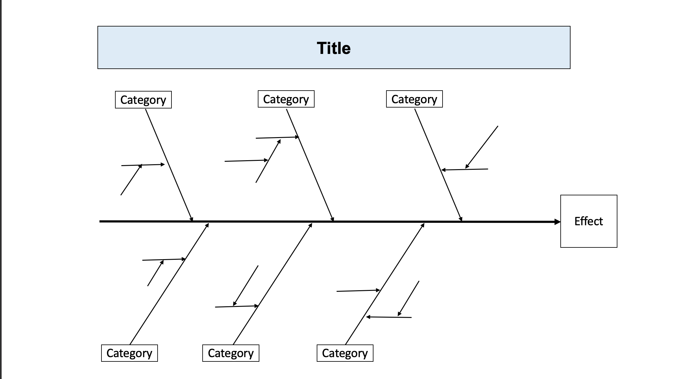
1.Make a cause-and-effect diagram (using 5 whys/why-why analysis) that organizes potential causes for high residential electricity bills: There must be at least 6 main categories. Circle and number the 5 causes that you think are the "main causes" of the problem.
\f
Step by Step Solution
There are 3 Steps involved in it

Get step-by-step solutions from verified subject matter experts