

Question: This dashboard has three visualizations that show the average amount of assets within a retirement plan per person in that plan, the balance of total
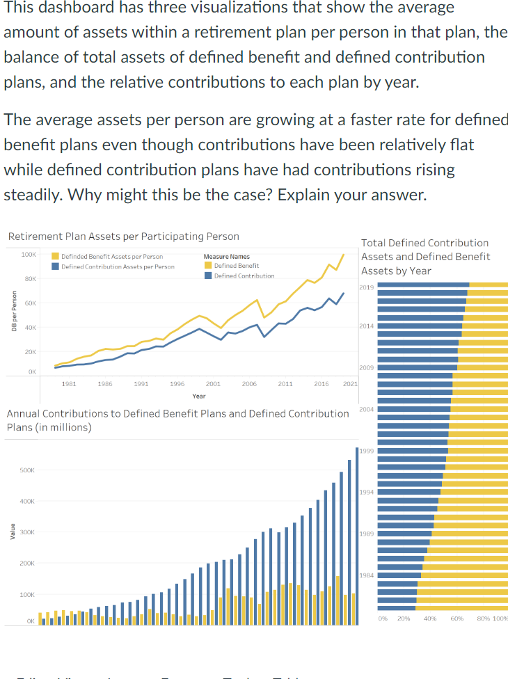
This dashboard has three visualizations that show the average amount of assets within a retirement plan per person in that plan, the balance of total assets of defined benefit and defined contribution plans, and the relative contributions to each plan by year. The average assets per person are growing at a faster rate for defined benefit plans even though contributions have been relatively flat while defined contribution plans have had contributions rising steadily. Why might this be the case? Explain your answer. Annual Contributions to Defined Benefit Plans and Defined Contribution Plans (in millions)
Step by Step Solution
There are 3 Steps involved in it
1 Expert Approved Answer
Step: 1 Unlock

Question Has Been Solved by an Expert!
Get step-by-step solutions from verified subject matter experts
Step: 2 Unlock
Step: 3 Unlock