

Question: This project will use html5 and css3 (with media queries: it will NOT use javascriet, Create a responsive web page using the grid and/or flexbox
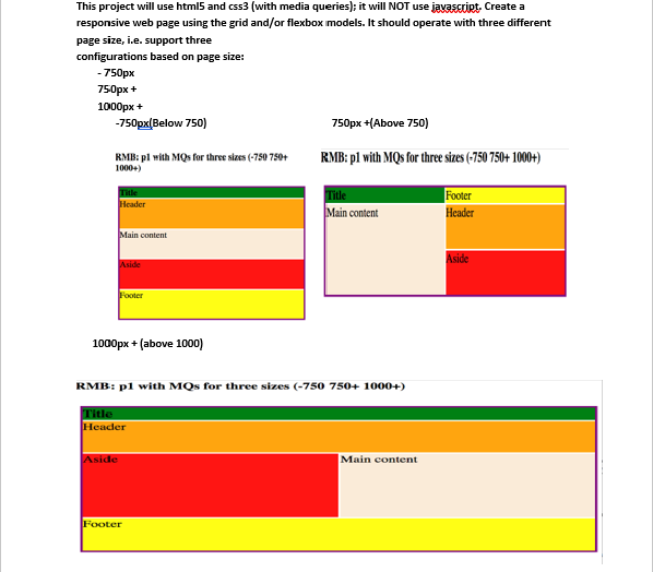
This project will use html5 and css3 (with media queries: it will NOT use javascriet, Create a responsive web page using the grid and/or flexbox models. It should operate with three different page size, i.e. support three based on page size: 750px 750px + 1000px+ -750px(Below 750) 750px +Above 750) RMB: pl with MQs for three se (750750+RMB: pl with MQs for three sizes (750 750+ 1000+) 1000+) Title lcader Title Main content Footer Header Main content SICC 1000px+(above 1000) RMB: pi with MOs for three sizes (-750 750+ 1000+ litle Headder Aside Main content Footer This project will use html5 and css3 (with media queries: it will NOT use javascriet, Create a responsive web page using the grid and/or flexbox models. It should operate with three different page size, i.e. support three based on page size: 750px 750px + 1000px+ -750px(Below 750) 750px +Above 750) RMB: pl with MQs for three se (750750+RMB: pl with MQs for three sizes (750 750+ 1000+) 1000+) Title lcader Title Main content Footer Header Main content SICC 1000px+(above 1000) RMB: pi with MOs for three sizes (-750 750+ 1000+ litle Headder Aside Main content Footer
Step by Step Solution
There are 3 Steps involved in it

Get step-by-step solutions from verified subject matter experts
 Study Help