

Question: This was a pie graph shown on Fox news. a) Is it misleading? If yes, how is it misleading? If no, please explain why this
This was a pie graph shown on Fox news. a) Is it misleading? If yes, how is it misleading? If no, please explain why this is an accurate graph. [hint: do the percentages add up to 100%?]
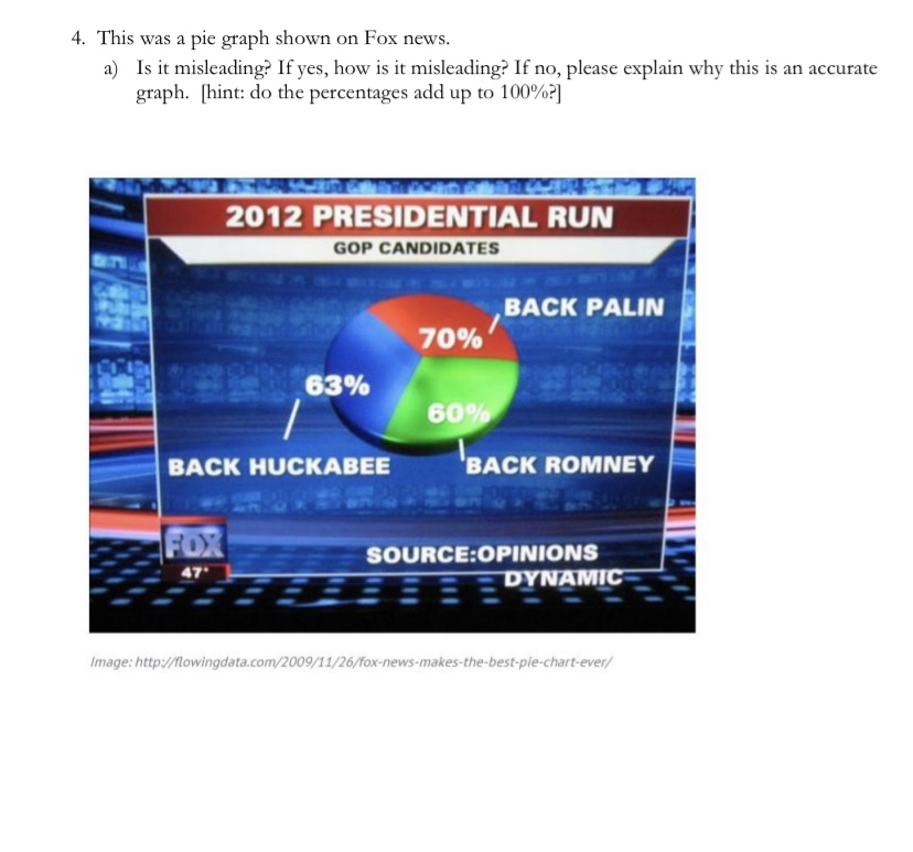
4. This was a pie graph shown on Fox news. a) Is it misleading? If yes, how is it misleading? If no, please explain why this is an accurate graph. [hint: do the percentages add up to 100%?] 2012 PRESIDENTIAL RUN GOP CANDIDATES BACK PALIN 70% 63% 60% BACK HUCKABEE `BACK ROMNEY FOR SOURCE:OPINIONS 47. F DYNAMIC Image: http://flowingdata.com/2009/11/26/fox-news-makes-the-best-pie-chart-ever/
Step by Step Solution
There are 3 Steps involved in it
1 Expert Approved Answer
Step: 1 Unlock

Question Has Been Solved by an Expert!
Get step-by-step solutions from verified subject matter experts
Step: 2 Unlock
Step: 3 Unlock