

Question: This week's signature assignment asks for several scatter plots and regression equations, which are automatically generated by Excel. The following is one of the scatter
This week's signature assignment asks for several scatter plots and regression equations, which are automatically generated by Excel. The following is one of the scatter plots that would appear in the solution of the assignment:
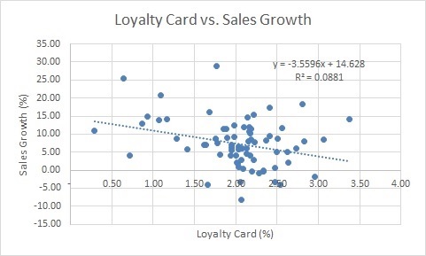
This graph shows the Loyalty Card (%) variable in the horizontal axis and the Sales Growth (%) variable in the vertical axis. Each dot corresponds to a data point from the database. There are 74 dots in total, one for each restaurant.
The regression equation generated by Excel appears in the upper right corner of the graph. The dashed line corresponds to this equation. Clearly, the line has a negative slope. This indicates that Sales Growth (%) decreases with an increasing Loyalty Card (%).
Based on this information, would you continue the Loyalty Card program? Why?
Loyalty Card vs. Sales Growth Loyalty Card vs. Sales Growth
Step by Step Solution
There are 3 Steps involved in it

Get step-by-step solutions from verified subject matter experts