

Question: To create a graph from the data below (partially shown) in Excel, you select the column all observations of Soft Drink Preference and insert
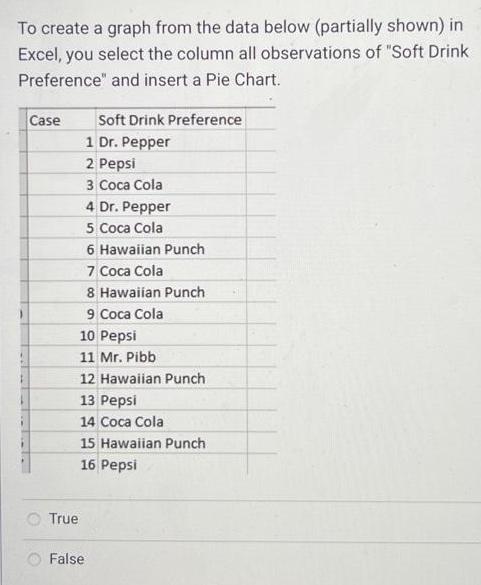
To create a graph from the data below (partially shown) in Excel, you select the column all observations of "Soft Drink Preference" and insert a Pie Chart. Case True Soft Drink Preference 1 Dr. Pepper 2 Pepsi 3 Coca Cola 4 Dr. Pepper 5 Coca Cola 6 Hawaiian Punch 7 Coca Cola 8 Hawaiian Punch 9 Coca Cola 10 Pepsi 11 Mr. Pibb. 12 Hawaiian Punch 13 Pepsi 14 Coca Cola 15 Hawaiian Punch 16 Pepsi False
Step by Step Solution
★★★★★
3.54 Rating (151 Votes )
There are 3 Steps involved in it
1 Expert Approved Answer
Step: 1 Unlock

The detailed answer for the above question is provided below True To create ... View full answer
Question Has Been Solved by an Expert!
Get step-by-step solutions from verified subject matter experts
Step: 2 Unlock
Step: 3 Unlock