Question: UNIT CLOSING CASE ONE Data Visualization: Storytelling with Data At the intersection of art and algorithm, data visualization schematically abstracts data to bring about a
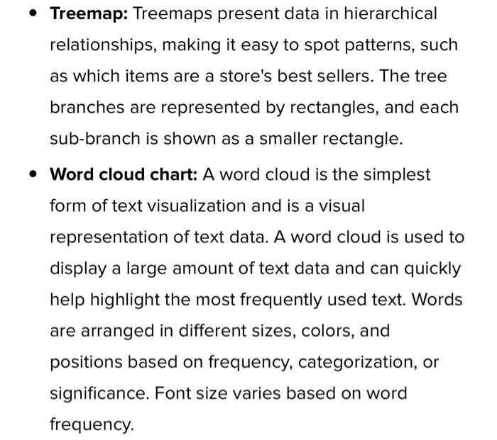
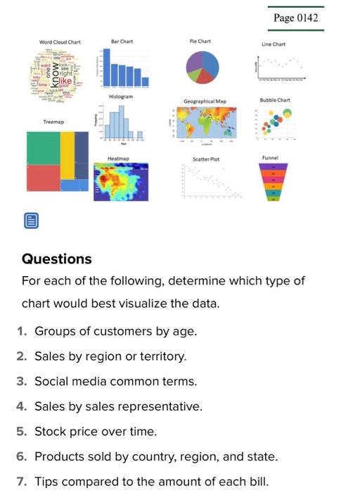
UNIT CLOSING CASE ONE Data Visualization: Storytelling with Data At the intersection of art and algorithm, data visualization schematically abstracts data to bring about a deeper understanding of the data, wrapping it in an element of awe. While the practice of visually representing data is arguably the foundation of all design, a newfound fascination with data visualization has been emerging. After The New York Times and The Guardian recently opened their online archives to the public, artists rushed to dissect nearly 2 centuries worth of data, elevating this art form to new prominence. For artists and designers, data visualization is a new frontier of self-expression, powered by the proliferation of data and the evolution of available tools. For enterprise, it is a platform for displaying products and services in the context of the cultural interaction that surrounds them, reflecting consumers' increasing demand for corporate transparency. Data visualization has nothing to do with pie charts and bar graphs, as they simply offer another view of the data making it easier to understand. Data visualization is actually a different way to view the data and highlights patterns, trends, and correlations. Choosing the right chart type is critical to telling your data story. Here are the top types of charts and the best time to use each. Chart types and visualizations - Bar chart: A bar chart presents categorical data (numbers only) in rectangular bars that differ in heights or lengths based on values. Bars can be plotted vertically or horizontally. A vertical bar chart - Bubble chart: A bubble chart is similar to a scatter plot except the values of the variables represented by the X and Y axes, and the area of each buble represents the third value. The size of the bubble is limited, and too many bubbles will make the chart difficult to read. - Funnel chart: The funnel chart shows the proportion of each area and visually reflects the size of each module. Funnel charts are great for comparing rankings. - Geographical map: A regional map is a map that uses color to represent the distribution of a certain range of values on a map. - Heat map: A heat map is used to indicate the weight of each point in the area, and the color refers to density. The darker the color of an area in a heat map showing air quality, for example, the worse the air quality of that area. - Histogram: A graph formed by joining the midpoints of histogram column tops. These graphs are used only when depicting data from the continuous variables such as time, weight, or age. - Line chart: A line chart shows data that connects, such as change in price over time. Line charts show changes over time or ordered categories and are used for trend comparison of large data volumes. - Pie chart: A pie chart displays data in a circle divided into slices by numerical proportions. Pie charts are widely used in various fields to represent the proportion of different classifications and to compare various classifications by the arc. It is not recommended to use pie charts as they are deceptive because as the series increases, each slice becomes smaller, until finally the size distinction is not obvious. - Scatter plot: A scatter plot displays the correlation between two variables. The position of the point is determined by the value of the variable. It is important to use a great deal of data when creating a scatter plot; otherwise, it is difficult to find the correlations. - Treemap: Treemaps present data in hierarchical relationships, making it easy to spot patterns, such as which items are a store's best sellers. The tree branches are represented by rectangles, and each sub-branch is shown as a smaller rectangle. - Word cloud chart: A word cloud is the simplest form of text visualization and is a visual representation of text data. A word cloud is used to display a large amount of text data and can quickly help highlight the most frequently used text. Words are arranged in different sizes, colors, and positions based on frequency, categorization, or significance. Font size varies based on word frequency. Questions For each of the following, determine which type of chart would best visualize the data. 1. Groups of customers by age. 2. Sales by region or territory. 3. Social media common terms. 4. Sales by sales representative. 5. Stock price over time. 6. Products sold by country, region, and state. 7. Tips compared to the amount of each bill