

Question: Use the table to the right and draw a scatter plot for the data. Scale your axes appropriately and label the axes and your points
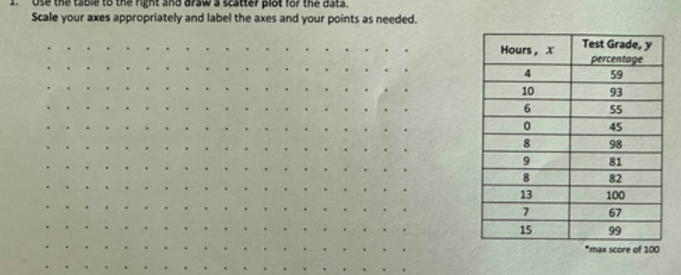
Use the table to the right and draw a scatter plot for the data. Scale your axes appropriately and label the axes and your points as needed. Hours , x Test Grade, y percentage 4 59 10 93 55 45 98 81 82 13 100 67 15 99 "max score of 100
Step by Step Solution
There are 3 Steps involved in it
1 Expert Approved Answer
Step: 1 Unlock

Question Has Been Solved by an Expert!
Get step-by-step solutions from verified subject matter experts
Step: 2 Unlock
Step: 3 Unlock