

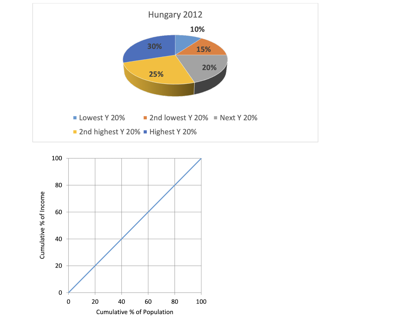
Question: Using data from the pie chart showing how income share is distributed across the poorest to richest population quintiles for Hungary, construct a Lorenz curve
Using data from the pie chart showing how income share is distributed across the poorest to richest population quintiles for Hungary, construct a Lorenz curve on the graph by connecting the points with straight lines. On the vertical axis indicate the associated cumulative income shares for each quintile.
By reference to different areas of the graph, explain how you would calculate the Gini coefficient from the Lorenz Curve shown below.
Hungary 2012 10% 30% 15% 20% 25% Lowest Y 20% 2nd lowest Y 20% Next Y 20% 2nd highest Y 20% = Highest Y 20% 100 80 60 Cumulative % of Income 40 20 0 20 40 60 80 100 Cumulative % of Population
Step by Step Solution
There are 3 Steps involved in it

Get step-by-step solutions from verified subject matter experts