

Question: Using Excel, create a scatter diagram of the data shown below including the linear equation of the relationship & the r2 coefficient. Make it look
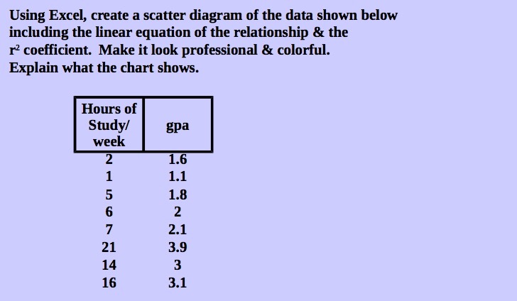
Using Excel, create a scatter diagram of the data shown below including the linear equation of the relationship & the r2 coefficient. Make it look professional & colorful. Explain what the chart shows. Hours of Study/ gpa week 1.6 1.1 1.8 2 2.1 21 3.9 14 3 16 3.1
Step by Step Solution
There are 3 Steps involved in it
1 Expert Approved Answer
Step: 1 Unlock

Question Has Been Solved by an Expert!
Get step-by-step solutions from verified subject matter experts
Step: 2 Unlock
Step: 3 Unlock