

Question: Using python to improve this bad bar chart and explain why is this bad: Problem 2: Bad pie chart (20 points) 1 Explain why this
Using python to improve this bad bar chart and explain why is this bad: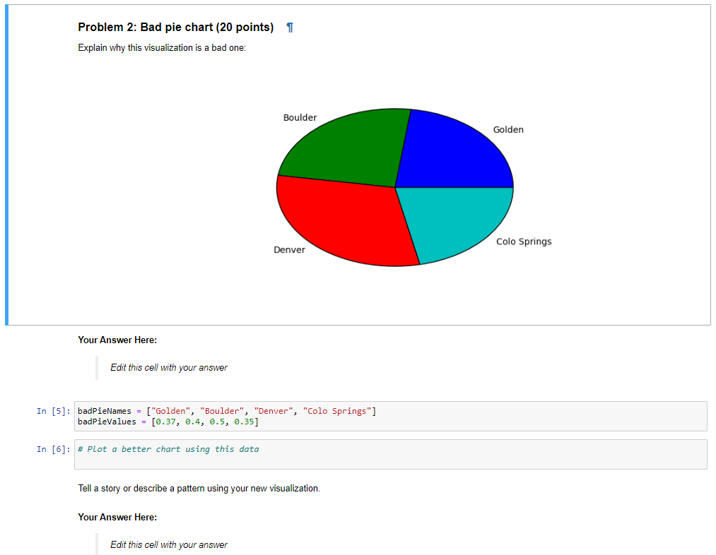
Problem 2: Bad pie chart (20 points) 1 Explain why this visualization is a bad one: Boulder Golden Colo Springs Denver Your Answer Here: Edit this cell with your answer In [5]: badPieNames = ["Golden", "Boulder", "Denver", "Colo Springs" ] badPieValues = [0.37, 0.4, 0.5, 0.35] In [6]: # Plot a better chart using this data Tell a story or describe a pattern using your new visualization. Your Answer Here: Edit this cell with your
Step by Step Solution
There are 3 Steps involved in it
1 Expert Approved Answer
Step: 1 Unlock

Question Has Been Solved by an Expert!
Get step-by-step solutions from verified subject matter experts
Step: 2 Unlock
Step: 3 Unlock