

Question: Using python to improve this bad bar chart and explain why is this bad: Problem 4: Bad bar chart 2 (20 points) Explain why this
Using python to improve this bad bar chart and explain why is this bad: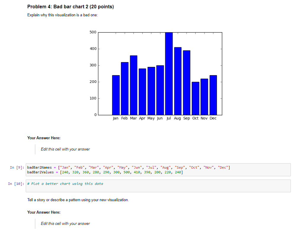
Problem 4: Bad bar chart 2 (20 points) Explain why this visualization is a bad one: 500 400 300 200 100 0 Jan Feb Mar Apr May Jun Jul Aug Sep Oct Nov Dec Your Answer Here: Edit this cell with your answer In [9]: badBar2Names = ["Ian", "Feb", "Mar", "Apr", "May", "Jun", "Jul", "Aug", "Sep", "Oct", "Nov", "Dec"] badbar2Values = [240, 320, 360, 280, 290, 300, 500, 410, 390, 200, 220, 240] In [10]: # Plot a better chart using this data Tell a story or describe a pattern using your new visualization. Your Answer Here: Edit this cell with your
Step by Step Solution
There are 3 Steps involved in it
1 Expert Approved Answer
Step: 1 Unlock

Question Has Been Solved by an Expert!
Get step-by-step solutions from verified subject matter experts
Step: 2 Unlock
Step: 3 Unlock