

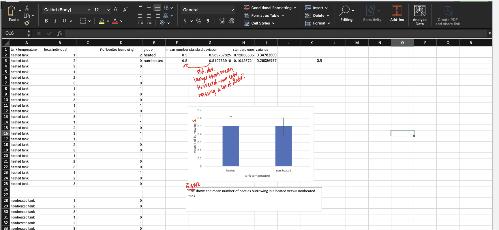
Question: We'll be using the figure below from Science Graphic Design to think about the elements of a successful Results section on a scientific poster. Let's
We'll be using the figure below fromScience Graphic Design to think about the elements of a successful Results section on a scientific poster. Let's think about what makes the results effective and visually compelling:
- First notice that there are no large blocks of text. Posters should be as brief as possible while effectively conveying information!
- At the top of the figure, themain finding of the research is reported in a single sentence with large, bolded text that is a different color than the detailed statistical results sentence (below).
- The more detailed results of theirstatistical analysis are also reported in a smaller, non-bolded font without an accent color at the bottom of the figure. Note they include the p-value for each test in parentheses immediately after stating the comparison.
- Differences in themedian (ormean) are highlighted in the figure
- Differences invariation about the median (or mean) are also highlighted within the figure.
Put it all together
Now that you've written the main finding, detailed statistics description, and in-figure information, it's time to put all that together with your own figure edited to consider graphic design elements. Using Excel and Powerpoint, create figure that showsclear consideration of, and effort to utilize, the graphic design principlesoutlined above. You should also decide where to place the text of your main finding and detailed statistics description relative to your figure in the way you would organize them on your poster.
Please do not copy the design of the figure shown above. This figure should be own creative design!
Assignment research data results.
Step by Step Solution
There are 3 Steps involved in it

Get step-by-step solutions from verified subject matter experts