

Question: What are the issues potentially with the below scatterplot of data (example data I made up showing anxiety and depression scores) if I decided to

- What are the issues potentially with the below scatterplot of data (example data I made up showing anxiety and depression scores) if I decided to run a correlation and report on it without doing anything else (look at the actual data points shown as well as the X and Y axis)? Assuming we looked past these issues, what can you tell from the graph if we were to run a correlation (size, direction, form, etc.; just some general predictions are fine)?
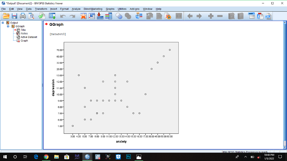
*Output1 [Document2] - IBM SPSS Statistics Viewer 0 X File Edit View Data Transform Insert Format Analyze Direct Marketing Graphs Utilities Add-ons Window Help @ Output DE GGraph + GGraph # m Title Notes [DataSet0] Active Dataset ydels ]- 70.00 60.00- 3200- 20.00- 13.00- 12.00- depression 11 00- 10.00- 900- O 8.00- 700- O O 6.00- O 100- O 3.00 4.00 5.00 7.00 800 9.00 11 0012.00 13.0014.00 15.00 16.00 1700 30.00 45.00 50.00 80 00 anxiety IBM 9898 Statistics Processor is ready l M Ps 10:40 PM A DO 1/5/2022
Step by Step Solution
There are 3 Steps involved in it
1 Expert Approved Answer
Step: 1 Unlock

Question Has Been Solved by an Expert!
Get step-by-step solutions from verified subject matter experts
Step: 2 Unlock
Step: 3 Unlock