

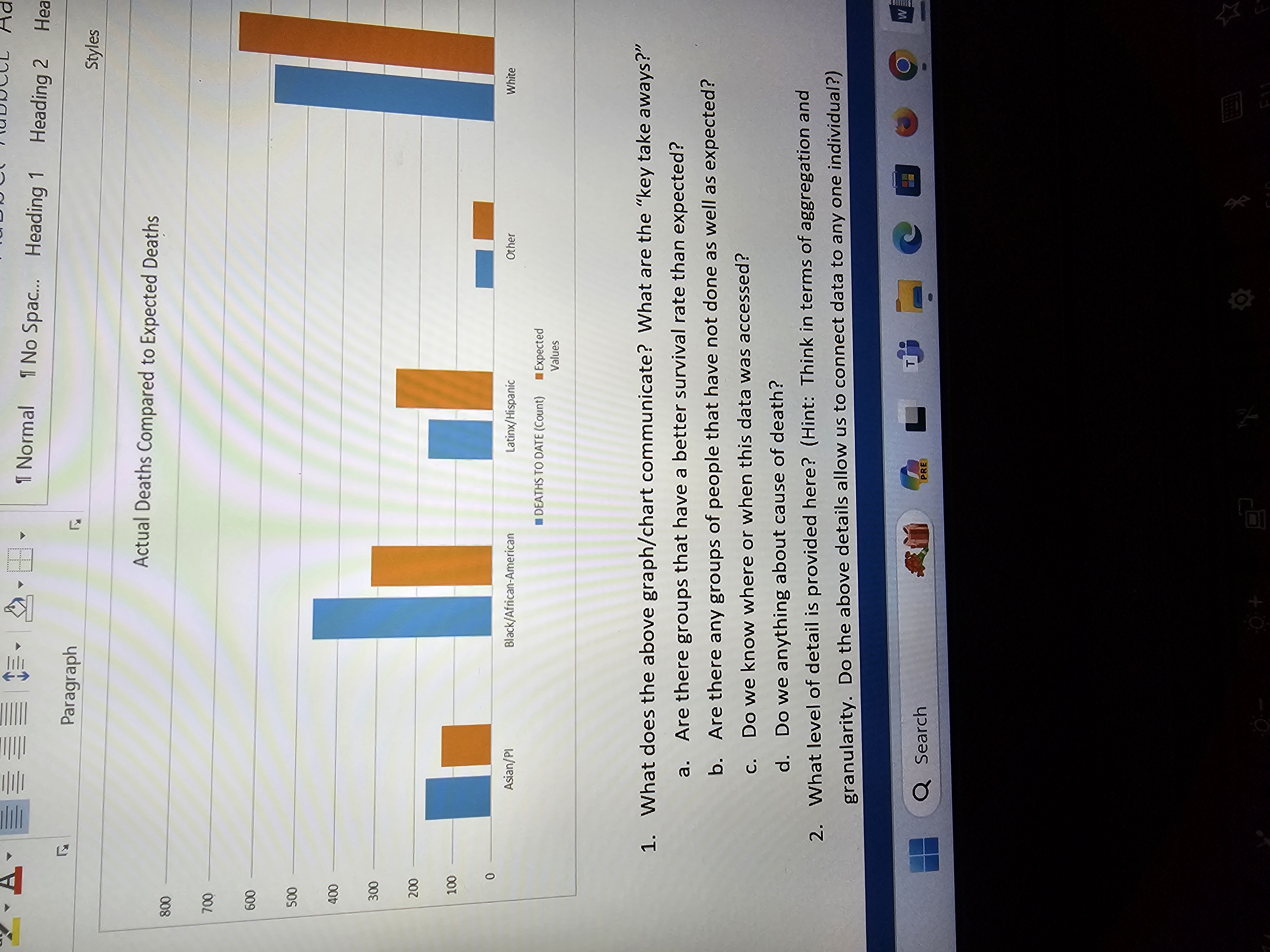
Question: What does the above graph / chart communicate? What are the key take aways? a . Are there groups that have a better survival rate
What does the above graphchart communicate? What are the "key take aways?"
a Are there groups that have a better survival rate than expected?
b Are there any groups of people that have not done as well as expected?
c Do we know where or when this data was accessed?
d Do we anything about cause of death?
What level of detail is provided here? Hint: Think in terms of aggregation and granularity. Do the above details allow us to connect data to any one individual?
Searchno
Step by Step Solution
There are 3 Steps involved in it
1 Expert Approved Answer
Step: 1 Unlock

Question Has Been Solved by an Expert!
Get step-by-step solutions from verified subject matter experts
Step: 2 Unlock
Step: 3 Unlock