

Question: What's Up with Data Visualization? Keeping It Real Discussion Please read through all sections before proceeding to the next page, and refer back whenever necessary.
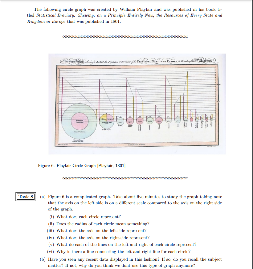
What's Up with Data Visualization? Keeping It Real Discussion Please read through all sections before proceeding to the next page, and refer back whenever necessary. v Expand All A Collapse All v Introduction Data visualization is a relatively recent term that applies not only to the tables, graphs. and charts you saw in the course resources but also to a wide array of colorful. dynamic even interactive illustrations of data that you see on the web. In this discussion, you will look back at some very early attempts to turn data into a picture as well as move beyond the static displays in the textbook. v Read & Complete To learn about the early attempts at data visualization, read Seeing and Understanding Data [PDF], IThis document, coauthored by ERAU professor Dr. Beverly Wood, is part ofa set of Primary Source Projects generated out of a National Science Foundab'onfunded curriculum project. The idea is to use original documents as an innovative way to discuss ways to display data that isn't the typical fare in textbooks. Complete the following for this discussion. - Read sections 14. - Select either one task that contains mulb'ple parts or select at least two tasks. - Complete your selected task or tasks by sharing your answers as your initial post. - Embed all images Your initial post should be two to three paragraphs in length. Use current APAformatting. > Post & Discuss The following circle graph was created by William Playfair and was published in his book ti- tled Statistical Breviary: Shewing, on a Principle Entirely New, the Resources of Every State and Kingdom in Europe that was published in 1801. #1017 1 1 1 Figure 6. Playfair Circle Graph [Playfair, 1801] Task 8 (a) Figure 6 is a complicated graph. Take about five minutes to study the graph taking note that the axis on the left side is on a different scale compared to the axis on the right side of the graph. (i) What does each circle represent? (ii) Does the radius of each circle mean something? (iii) What does the axis on the left-side represent? (iv) What does the axis on the right-side represent? (v) What do each of the lines on the left and right of each circle represent? vi) Why is there a line connecting the left and right line for each circle? (b) Have you seen any recent data displayed in this fashion? If so, do you recall the subject matter? If not, why do you think we dont use this type of graph anymore
Step by Step Solution
There are 3 Steps involved in it

Get step-by-step solutions from verified subject matter experts