Question: When it comes to representing data in a presentation, which if these is the best guiding principle? a compelling infographic can really make the data

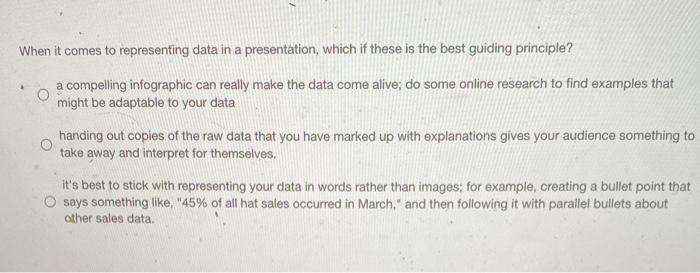
When it comes to representing data in a presentation, which if these is the best guiding principle? a compelling infographic can really make the data come alive; do some online research to find examples that might be adaptable to your data handing out copies of the raw data that you have marked up with explanations gives your audience something to take away and interpret for themselves. it's best to stick with representing your data in words rather than images, for example, creating a bullet point that O says something like, "45% of all hat sales occurred in March," and then following it with parallel bullets about other sales data
Step by Step Solution
There are 3 Steps involved in it

Get step-by-step solutions from verified subject matter experts


