

Question: You will build up a semi - responsive web page, with Media Queries, and using Flexbox to display coupons in an article flexbox container, with
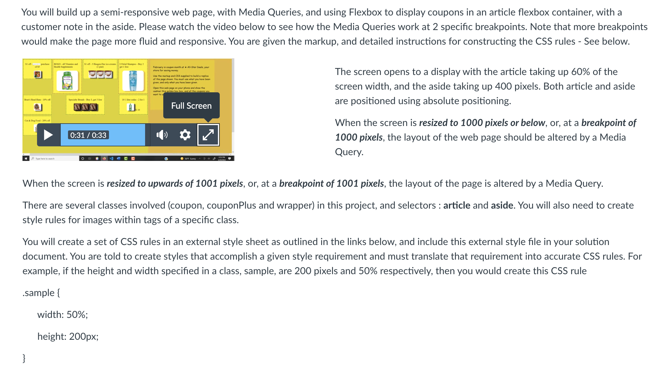
You will build up a semiresponsive web page, with Media Queries, and using Flexbox to display coupons in an article flexbox container, with a
customer note in the aside. Please watch the video below to see how the Media Queries work at specific breakpoints. Note that more breakpoints
would make the page more fluid and responsive. You are given the markup, and detailed instructions for constructing the CSS rules See below.
The screen opens to a display with the article taking up of the
screen width, and the aside taking up pixels. Both article and aside
are positioned using absolute positioning.
When the screen is resized to pixels or below, or at a breakpoint of
pixels, the layout of the web page should be altered by a Media
Query.
When the screen is resized to upwards of pixels, or at a breakpoint of pixels, the layout of the page is altered by a Media Query.
There are several classes involved coupon couponPlus and wrapper in this project, and selectors : article and aside. You will also need to create
style rules for images within tags of a specific class.
You will create a set of CSS rules in an external style sheet as outlined in the links below, and include this external style file in your solution
document. You are told to create styles that accomplish a given style requirement and must translate that requirement into accurate CSS rules. For
example, if the height and width specified in a class, sample, are pixels and respectively, then you would create this CSS rule
sample
width: ;
height: px;
Step by Step Solution
There are 3 Steps involved in it
1 Expert Approved Answer
Step: 1 Unlock

Question Has Been Solved by an Expert!
Get step-by-step solutions from verified subject matter experts
Step: 2 Unlock
Step: 3 Unlock
 Study Help