

Question: Discuss the chart in Figure 2.4a. Why does it only show taxpayer income levels from the top 1% to the top 25%? What does it
Discuss the chart in Figure 2.4a. Why does it only show taxpayer income levels from the top 1% to the top 25%? What does it tell us about the relative tax burden on each group shown? Do you think its claim that the “rich pay more” is an honest depiction or a distortion of the facts? Defend your opinion.
Figure 2.4a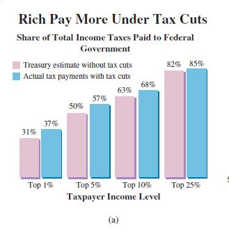
Rich Pay More Under Tax Cuts Share of Total Income Taxes Paid to Federal Government | Treasury estimate without tax cuts 82% 85% Actual tax payments with tax cuts 68% 63% 57% 50% 37% 31% Top 1% Top 5% Top 10% 25% Taxpayer Income Level (a)
Step by Step Solution
3.32 Rating (149 Votes )
There are 3 Steps involved in it
After looking to the chart Why does it show only upto 25 of the bars Answer If you see the numbers g... View full answer

Get step-by-step solutions from verified subject matter experts