

Question: 2.85 Enrollment trends Examples 18 and 19 presented graphs showing the total student enrollment at a U.S. university between 2004 and 2012 and the data
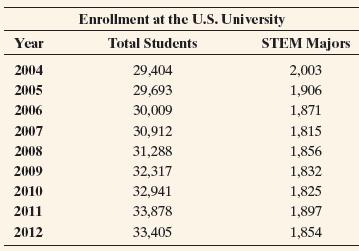
2.85 Enrollment trends Examples 18 and 19 presented graphs showing the total student enrollment at a U.S. university between 2004 and 2012 and the data for STEM major enrollment during that same time period. The data are repeated here.
a. Construct a graph for only STEM major enrollments over this period. Describe the trend in these enrollment counts.
b. Find the percentage of enrolled students each year who are STEM majors and construct a time plot of the percentages.
c. Summarize what the graphs constructed in parts a and b tell you that you could not learn from Figures 2.18 and 2.19 in Examples 18 and 19.
Enrollment at the U.S. University Year Total Students STEM Majors 2004 29,404 2,003 2005 29,693 1,906 2006 30,009 1,871 2007 30,912 1,815 2008 31,288 1,856 2009 32,317 1,832 2010 32,941 1,825 2011 33,878 1,897 2012 33,405 1,854
Step by Step Solution
There are 3 Steps involved in it

Get step-by-step solutions from verified subject matter experts