

Question: 8. MegaStat steps to create the stem-and-leaf chart are as follows: a. Open Excel and from Connect, select Data Files, Tables and select Table 211.
8. MegaStat steps to create the stem-and-leaf chart are as follows:
a. Open Excel and from Connect, select Data Files, Tables and select Table 2–11.
b. Click MegaStat, Descriptive Statistics, and select Stem and Leaf Plot. In the dialog box, enter the data range from A1:A46 and select OK. The stem-and-leaf plot will appear on the Output sheet.
a. Open Excel, and from Connect, select Data Files, Tables, and Table 2–1, Orleans Pivot Table Data.
b. Click on a cell somewhere in the data set, such as cell C6.
c. Click on the INSERT menu on the toolbar. Then click PivotTable.
d. The following screen will appear:
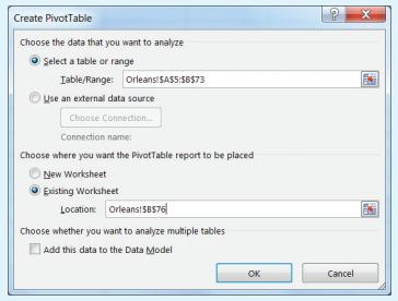
Select “Select a table or range,” to select the data range as shown in the Table/Range row. Next, select “Existing Worksheet” and enter a cell location, such a B76 and click OK.
e. On the right-hand side of the spreadsheet, a PivotTable Fields list will appear with a list of the data set variables. To summarize the “Type” variable, select the “Type” variable and it will appear in the lower left box called ROWS. You will note that the frequency table is started in cell B76 with the rows labelled with the values of the variable “Type.” Next, return to the top box, and select and drag the “Type” variable to the “Σ VALUES” box. A column of frequencies will be added to the table. Note that you can format the table to centre the values and also relabel the column headings, as needed.
f. To create the bar chart, select any cell in the PivotTable, such as cell C78. Next, select the INSERT menu from the toolbar and within the Charts group, select a chart from the Insert Column Chart drop-down menu. A chart appears. “Edit the chart,” as needed. To eliminate the space between the bars, right click any bar and select ‘Format Data Series.’ Select ‘Series Options’ and change the ‘Gap Width’ to 0% and the ‘Series Overlap’ to 100%. g. To create the pie chart, the frequencies should be converted to relative frequencies. Click in the body of the PivotTable and the PivotTable Fields list will appear to the right. In the “Σ Values” box, click on the pull-down menu for “Count of Type” and select the Value Fields Settings option. You will see a number of different selections that can be used to summarize the variables in a PivotTable. Click on the tab “Show Values As” and, in the pulldown menu, select “% of Grand Total.” Click OK. The frequencies will be converted to percentages. To create the pie chart, select any cell in the PivotTable. Next, select the INSERT menu from the toolbar, and within the Charts group, select a pie chart from the Insert Pie drop-down menu. A pie chart appears. Click on the chart heading and label the chart as needed. To add the percentages, right click on the pie chart and a menu will appear. Click on “Add Data Labels.”
Create PivotTable Choose the data that you want to analyze Select a table or range Table/Range: Orleans!$A$5:$B$73 Use an external data source Choose Connection... Connection name: Choose where you want the PivotTable report to be placed New Worksheet Existing Worksheet Location: Orleans!$B$76 Choose whether you want to analyze multiple tables Add this data to the Data Model x OK Cancel
Step by Step Solution
There are 3 Steps involved in it

Get step-by-step solutions from verified subject matter experts