

Question: Figure 2.4 shows a bar chart and a pie chart for what employed adults did the last time they were sick. a. Create an exploded
Figure 2.4 shows a bar chart and a pie chart for what employed adults did the last time they were sick.
a. Create an exploded pie chart, a cone chart, or a pyramid chart that shows how employed adults who work outside the home responded to being sick.
b. Which graphs either seen in Figure 2.4 or created in (a), do you prefer? Explain.
Figure 2.4
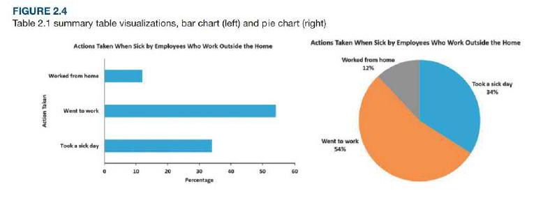
FIGURE 2.4 Table 2.1 summary table visualizations, bar chart (left) and pie chart (right) Actions Taken When Sick by Employees Who Work Outside the Home Actions Taken When Sick by Employees Who Work Outside the Home Worked from home 12% Worked trom heme Took a sick day 34% Went to work Went to work Took a sick day 54% 10 20 40 60 Percentage Action Taken
Step by Step Solution
3.44 Rating (160 Votes )
There are 3 Steps involved in it
A b Exploed Pie Ch... View full answer

Get step-by-step solutions from verified subject matter experts