

Question: Figures 2.5 and 2.6, show a bar chart and a pie chart for the risk level for the retirement fund data. a. Create an exploded
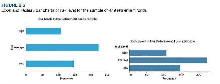
Figures 2.5 and 2.6, show a bar chart and a pie chart for the risk level for the retirement fund data.
a. Create an exploded pie chart, a doughnut chart, a cone chart, and a pyramid chart that show the risk level of retirement funds.
b. Which graphs, either seen in Figures 2.5 and 2.6 or created in (a), do you prefer? Explain.
Figures 2.5 and 2.6
Figures 2.6
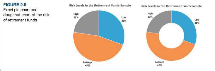
FIGURE 2.5 Excel and Tableau bar charts of risk level for the sample of 479 retirement funds Risk Levels in the Retirement Funds Sample High Risk Level in the Retirement Funds Sample Average Risk Level High Average Low Low 50 100 150 200 250 50 100 150 200 Frequency Frequency Risk
Step by Step Solution
3.35 Rating (158 Votes )
There are 3 Steps involved in it
A b Actions Taken When S... View full answer

Get step-by-step solutions from verified subject matter experts