

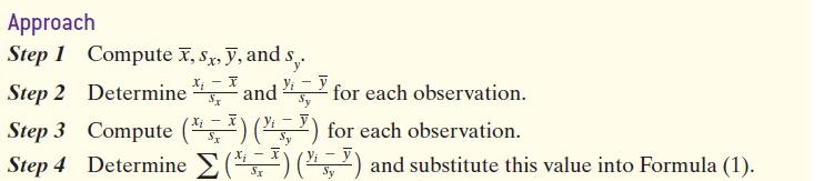
Question: For the data shown in Table 2, compute the linear correlation coefficient. A scatter diagram of the data is shown in Figure 6. The dashed
For the data shown in Table 2, compute the linear correlation coefficient. A scatter diagram of the data is shown in Figure 6. The dashed lines on the scatter diagram represent the mean of x and the mean of y.
Formula 1
Figure 6 Table 2 x y 20 20 1 18 18- 3 13 16 3 6 9 9 14- 12- 7 4 10 8- 6- 4 2 0 2 x=4 3. 4 5 -5 -7 96 y = 10 T 8
Step by Step Solution
★★★★★
3.46 Rating (143 Votes )
There are 3 Steps involved in it
1 Expert Approved Answer
Step: 1 Unlock

Question Has Been Solved by an Expert!
Get step-by-step solutions from verified subject matter experts
Step: 2 Unlock
Step: 3 Unlock