

Question: Explain what is wrong with the following pie chart, which depicts the federal government breakdown by category for 2010. Federal Spending for 2010 Education (1%)
Explain what is wrong with the following pie chart, which depicts the federal government breakdown by category for 2010.
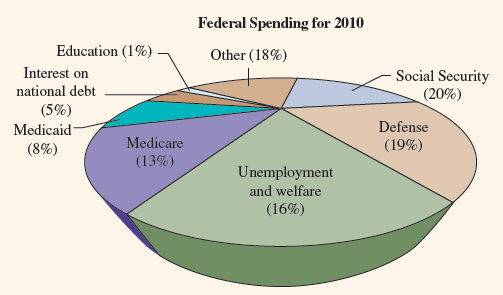
Federal Spending for 2010 Education (1%) Other (18%) Interest on Social Security (20%) national debt (5%) Defense Medicaid Medicare (19%) (8%) (13%) Unemployment and welfare (16%)
Step by Step Solution
★★★★★
3.33 Rating (162 Votes )
There are 3 Steps involved in it
1 Expert Approved Answer
Step: 1 Unlock

The slices do not seem ... View full answer
Question Has Been Solved by an Expert!
Get step-by-step solutions from verified subject matter experts
Step: 2 Unlock
Step: 3 Unlock
Document Format (2 attachments)
1544_605d88e1f2072_675859.pdf
180 KBs PDF File
1544_605d88e1f2072_675859.docx
120 KBs Word File