

Question: The data displayed in the plot below are from a nearly complete record of body masses of the worlds native mammals (in grams, then converted
The data displayed in the plot below are from a nearly complete record of body masses of the world’s native mammals (in grams, then converted to log-base 10; Smith et al. 2003). The data were divided into three groups: those surviving from the last ice age to the present day (n=4061) those who went extinct around the end of the last ice age (n=227) and those driven extinct within the last 300 years (recent; n=44 ).
a. What type of graph is this?
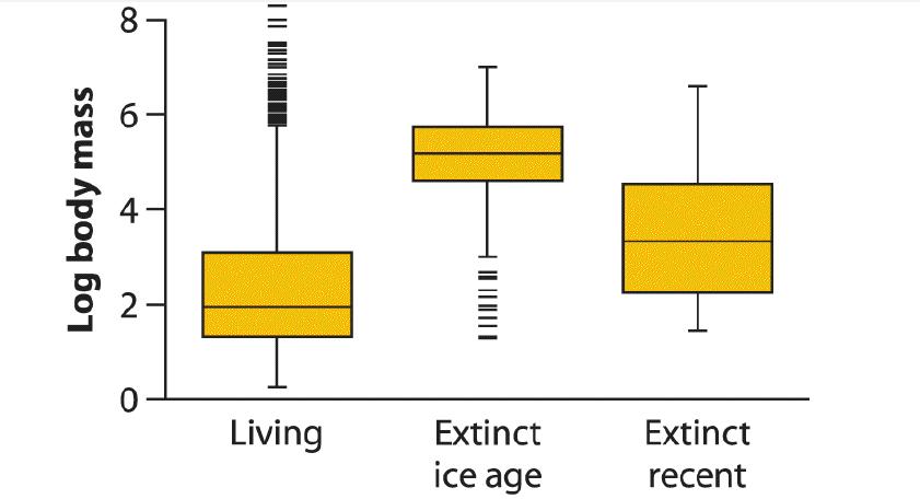
b. What does the horizontal line in the center of each rectangle represent?
c. What are the horizontal lines at the top and bottom edges of each rectangle supposed to represent?
d. What are the data points (indicated by “—”) lying outside the rectangle?
e. What are the vertical lines extending above and below each rectangle?
f. Compare the locations of the three body-size distributions. How do they differ?
g. Compare the shapes of the three frequency distributions. Which are relatively symmetric and which are asymmetric? Explain your reasoning.
h. Which group’s frequency distribution has the lowest spread? Explain your reasoning.
i. What has been the likely effect of ice-age and recent extinctions on the median body size of mammals?
mass Log body 8 16 0 Living Extinct ice age Extinct recent
Step by Step Solution
3.49 Rating (172 Votes )
There are 3 Steps involved in it
a Box plot b Median body mass of the mammals in each group c The first and third quartiles of body m... View full answer

Get step-by-step solutions from verified subject matter experts