

Question: Figure 4 shows a scatterplot for the variables life expectancy and infant mortality in 16 countries. What type of correlation does it show? Does this
Figure 4 shows a scatterplot for the variables life expectancy and infant mortality in 16 countries. What type of correlation does it show? Does this correlation make sense? Does it imply causality? Explain.
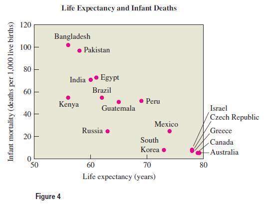
Infant mortality (deaths per 1,000 live births) 120 100 80 Life Expectancy and Infant Deaths Bangladesh Pakistan India Egypt 60 Brazil Peru Kenya Guatemala 40 40 20 20 Russia 50 60 Figure 4 Israel Czech Republic Mexico Greece South Canada Korea -Australia 70 88 80 Life expectancy (years)
Step by Step Solution
3.54 Rating (147 Votes )
There are 3 Steps involved in it
The diagram shows a moderate negative correlation in which countries with lowe... View full answer

Get step-by-step solutions from verified subject matter experts