

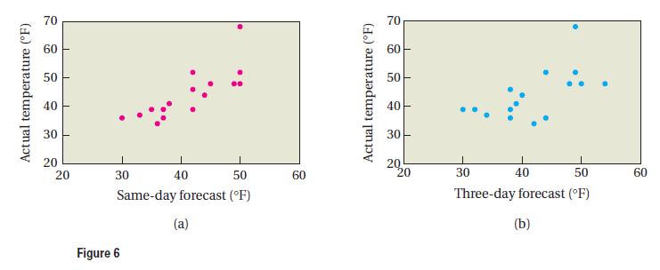
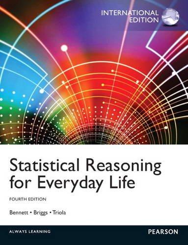
The scatterplots in Figure 6 show two weeks of data comparing the actual high temperature for the
Question:
The scatterplots in Figure 6 show two weeks of data comparing the actual high temperature for the day with the same-day forecast (part a) and the three-day forecast (part b). Estimate the correlation coefficient for each data set and discuss what these coefficients imply about weather forecasts.
Fantastic news! We've Found the answer you've been seeking!
Step by Step Answer:
If every forecast were perfect each actual temperature would equal the correspond...View the full answer

Answered By
PALASH JHANWAR
I am a Chartered Accountant with AIR 45 in CA - IPCC. I am a Merit Holder ( B.Com ). The following is my educational details.
PLEASE ACCESS MY RESUME FROM THE FOLLOWING LINK: https://drive.google.com/file/d/1hYR1uch-ff6MRC_cDB07K6VqY9kQ3SFL/view?usp=sharing
3+ Reviews
10+ Question Solved
Related Book For 
Statistical Reasoning For Everyday Life
ISBN: 9780321904645
4th International Edition
Authors: Jeffrey Bennett, William L. Briggs, Mario F. Triola
Question Posted:
