

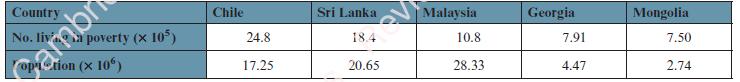
The following table shows estimates, in hundred thousands, of the number of people living in poverty and
Question:
The following table shows estimates, in hundred thousands, of the number of people living in poverty and the populations, in millions, of the countries where they live.
Represent, in a single diagram, the actual numbers and the relative poverty that exists in these countries.
In what way do the two sets of data in your representation give very different pictures of the poverty levels that exist? Which is the better representation to use and why?
Fantastic news! We've Found the answer you've been seeking!
Step by Step Answer:
This representation allows you to compare both the actual numbers and the relative poverty levels in ...View the full answer

Answered By
Hillary Waliaulah
As a tutor, I am that experienced with over 5 years. With this, I am capable of handling a variety of subjects.
17+ Reviews
30+ Question Solved
Related Book For 

Cambridge International AS & A Level Mathematics Probability & Statistics 1 Coursebook
ISBN: 9781108407304
1st Edition
Authors: Dean Chalmers, Julian Gilbey
Question Posted:
